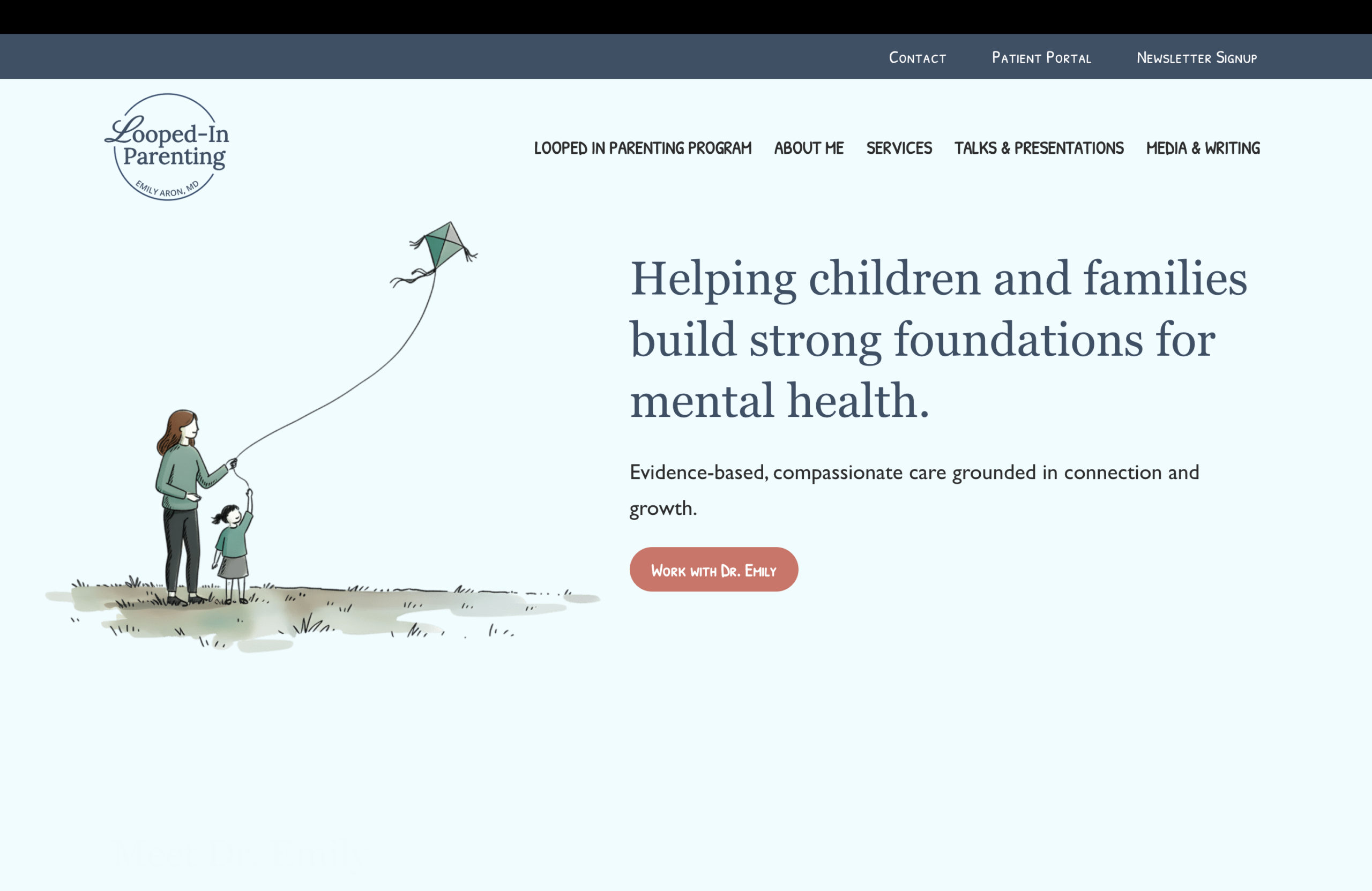
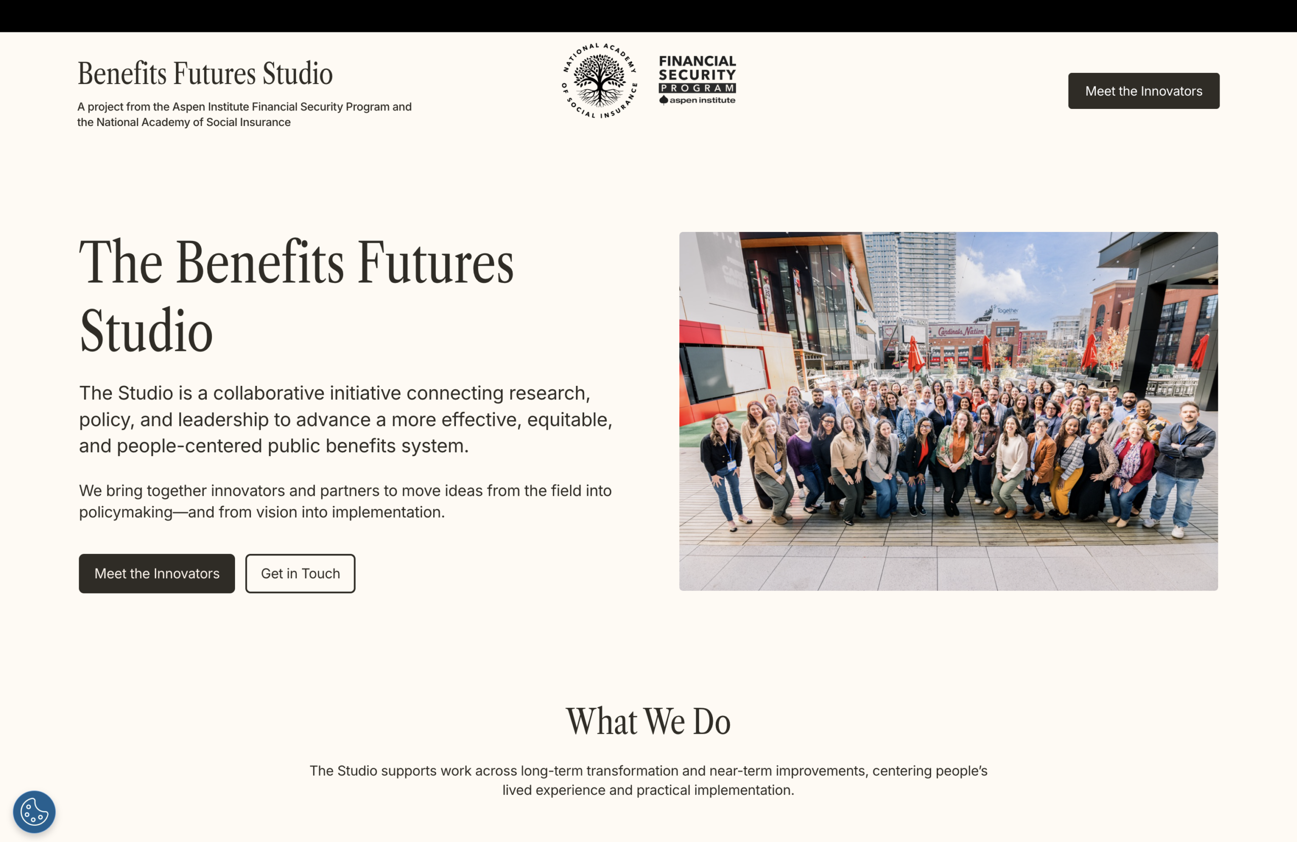
As they approached their eight year anniversary, the Next50 team knew it was time for an overhaul, not just of their brand, but of their entire site, to more closely align with their core values and goals. We were beyond happy to be a part of this project and revitalize the site to help them continue their work.
Like many older sites, the Next50 web presence had become outdated, difficult to navigate, and hard to edit. This meant that their team, and by extension their users, weren’t getting the most of their site as they could. With their redesign, our top concerns were:
- Accessibility
- Usability
- Developing a more cohesive sense of identity and branding across the site
As an organization that works with older adults and other groups dedicated to supporting the aging population, accessibility was a major concern. We knew this boiled down to navigational issues and certain elements of the old design, so we started with developing a sitemap and revamping the menu to more clearly direct visitors where they want to be and provide accurate information for those using screen readers or other accessibility tools.
The design elements went hand-in-hand with this, as we built out the site to be more mobile friendly, have a more accessible color palette, and for general intuitiveness and aesthetics.
On top of this, we ran the site through a meticulous usability testing process, making sure that everything worked both on the front and back end as planned, with those on the Next50 team being able to edit, publish, and manage the site with ease and visitors being able to use the site to find the information they’re looking for.
As a rebrand of both the site and their organization as a whole, we knew we had to make sure that their branding was entirely cohesive and consistent site-wide. This meant updating their logo, creating a design that utilized their brand colors and identity, and collaborating with their third party development team to get every aspect from the URL to the blocks we used just right.
Now they have a great new site that aligns more closely with their goals, helps their users get to the information they need faster, and looks fantastic with their new name and logo, but the same care they’ve always taken as an organization. With this new look they were able to improve accessibility and usability, and we’re grateful for being able to work with such a great team.


