When a voter Googles your candidate’s name, what do they find? Hopefully, the top result is your political campaign website!
Your campaign’s website is your digital handshake—often the very first impression you make on a constituent. It needs to do more than just look good. Effective political website design must actively educate voters, showcase values, and drive donations even when your candidate isn’t in the room.
Whether you hire a professional design agency or take the DIY approach, your site needs to convert visitors into active supporters. Ready to build a site that wins votes? We’ll cover everything you need to know:
- The Importance of Designing a Strong Political Campaign Website
- Choosing An Effective Political Website Builder
- 8 Political Website Design Tips To Supercharge Your Approach
- Working With A Political Website Design Company
- Powerful Political Campaign Website Examples
Designing a platform that resonates with voters is an investment, but understanding these fundamentals will put you ahead of the competition. First, let’s examine how your political website design directly impacts your campaign’s legitimacy.
The Importance of Creating a Political Campaign Website
When voters hear your name, they’ll head to the internet to find out more about you. Your political campaign website will be their first impression of your entire candidacy. Today, a modern, tech-savvy website is the norm for political candidates, and even at their bare minimum, political campaign websites need to meet a certain level of design quality.
A quality website will enhance your candidacy by presenting your campaign as well-funded, sophisticated, and up-to-date with current technology. Outside of just your candidate’s brand and image, your website’s design will invite visitors to learn and interact with your campaign, converting potential voters in the process.
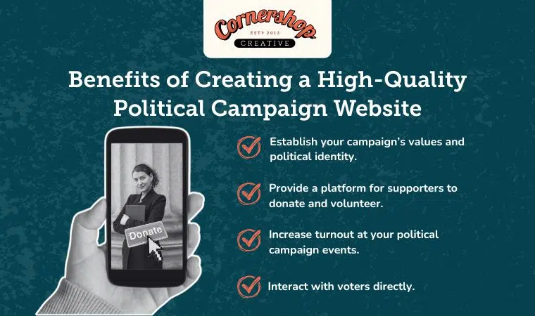
Establish your campaign’s values and political identity.
Your website is one of the only spaces where you control the narrative completely. A strong political website design does more than just list a candidate’s biography; it visually reinforces their values and helps voters instantly recognize the platform’s brand.
By using consistent colors, fonts, and high-impact imagery, you create a professional identity that builds trust. Whether it’s a hero image of the candidate engaging with the community or a clean layout that makes their stance on key issues clear, every design choice should help constituents feel confident in your candidate’s leadership. When voters clearly understand who the candidate is and what they stand for, they are more likely to head to the polls.
Provide a platform for supporters to donate and volunteer.
Campaigns run on momentum, and your website is the engine that captures it. A primary benefit of a well-optimized political campaign website is its ability to convert casual interest into tangible support immediately.
Don’t make supporters hunt for a way to help. By placing large, bold “Donate” and “Volunteer” buttons front and center, you remove friction and increase conversion rates. Modern fundraising integrations ensure that when a voter feels inspired to give, the donation process is secure and seamless, helping you capture vital contributions that fuel the campaign.
Increase turnout at your political campaign events.
Nothing signals a winning campaign like a packed room. Your website should serve as the central hub for your schedule, making it effortless for supporters to find rallies, town halls, and meet-and-greets.
An interactive events calendar drives attendance. By allowing visitors to RSVP directly on the site or sync events to their personal calendars, you reduce the likelihood of no-shows. Furthermore, a busy, up-to-date events page visually demonstrates that your political campaign is active, energetic, and worth paying attention to.
Interact with voters directly.
In an era of social media algorithms and soundbites, your website offers a direct line of communication to your constituents. Effective political website design carves out spaces for news updates, press releases, and blog posts, allowing you to bypass traditional media filters and speak directly to the people. Use your site to host:
- A “News” or “Blog” section for detailed policy updates and press releases.
- Live Q&A sessions with chat features to answer constituent concerns in real-time.
- Surveys and polls to gather feedback and make voters feel heard.
This two-way engagement fosters a sense of community and proves that you are listening. When voters feel heard and connected to your campaign, they become true advocates.
Choosing An Effective Political Website Builder
If your campaign is short on time or technical expertise, political website builders are a powerful way to get online quickly. However, not all platforms offer the same tools. To ensure your site is professional and effective, look for these four essential features before choosing a content management system (CMS).
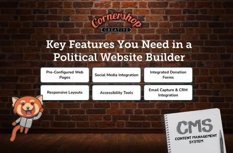
1. Pre-Configured Web Pages
Regardless of your specific design choices, every political campaign website needs the following core pages:
- About: A biography section that highlights the candidate’s personal story, qualifications, and connection to the community
- Issues: A clear breakdown of the campaign’s platform, detailing where stances on key policy topics
- Newsfeed/Blog: The hub for press releases, campaign updates, and event recaps to keep your content fresh
- Contact Us: A direct line for voters to ask questions, media to make inquiries, and volunteers to sign up
- Donation Form: A secure, optimized page dedicated exclusively to accepting contributions
A website builder that provides these well-designed pages for you will cut your work in half. Your team will still need to customize the content on these pages, but the technical heavy lifting will already be taken care of, letting you focus on communicating your platform’s message.
2. Social Media Integration
Your political campaign website’s homepage should do more than just link to your candidate’s profiles; it should bring their social feed directly to voters. Look for a builder that embeds live social media posts onto your site. This keeps visitors on the page longer while showing the real-time buzz and momentum your campaign is generating.
3. Integrated Donation Forms
Donations fuel your campaign, and the process must be frictionless. Redirecting supporters to a third-party site to contribute can cause hesitation and trust issues. Instead, choose a builder that integrates payment forms directly into your political website design. Keeping the donation experience on your own domain builds trust and significantly increases conversion rates.
4. Responsive Layouts
Mobile devices (excluding tablets) account for more than 60% of global website traffic. With the majority of voters accessing information on their phones, a site that isn’t mobile-friendly will look outdated and potentially insecure.
Ensure your builder uses themes that automatically format text and images for mobile devices. A site that loads quickly and looks great on a smartphone is non-negotiable for reaching voters on the go.
5. Email Capture & CRM Integration
A robust political website builder must go beyond simple contact forms by helping you build your email marketing list. Look for tools that offer pop-ups, splash pages, and newsletter sign-ups that integrate directly with political CRMs like NGP VAN or ActionNetwork. Popular platforms like WordPress provide native integrations and plugins that make this process seamless.
Automated integration saves your team hours of manual data entry. When a supporter signs up to volunteer, their data will flow instantly into your voter file, allowing you to target them with specific fundraising emails or get-out-the-vote (GOTV) messages immediately.
6. Accessibility Tools
Inclusivity is a core value of democracy, and your political campaign website must reflect that. An inaccessible site not only alienates voters with disabilities but also opens your campaign to potential lawsuits. Ensure your builder offers “accessibility-ready” themes or built-in auditing tools that automatically check for color contrast issues and screen reader compatibility.
A fully accessible site ensures every constituent—regardless of ability—can engage with your campaign, demonstrating a genuine commitment to serving all voters. Working with our web design professionals means you’ll have a website that any supporter can interact with to learn more and get involved.
Our Favorite Political Campaign Website Builder: WordPress
In our experience, WordPress is the best choice for building a website, and political campaign websites are no exception. Its robust library of plugins and customization tools will help your campaign shine and can accomplish whatever features and functionality you need on the site.
WordPress offers the ability to customize nearly every aspect of your website to present your content exactly how you’d like. Plus, WordPress’s extensive support network of plugin creators and design consultants ensures that a beautiful, dynamic website is possible for everyone — even without coding knowledge.
Other Top Political Website Builders
WordPress is not the only option for building your campaign website. Other popular website builders for political sites include Squarespace, Wix, Weebly, and more. All of these options will include basic website features to get your website off the ground and supporting your campaign and constituents’ needs.
8 Tips for Designing a Political Campaign Site
As you review political campaign web builders and design consultants, you’ll find examples of past clients. While most of us recognize strong web design when we see it, articulating what makes it strong is trickier without knowledge of web design principles.
To understand why some designs work and others appear to be missing something, explore these strong web design strategies for political campaigns.
For a quick rundown of must-know strategies, nail down the basics with these interactive flashcards:
1. Use high-impact pictures of people.
The images on your political campaign website create your first impression. People’s eyes are naturally attracted to brightly colored pictures over text. Plus, strong images will make your campaign more memorable. In fact, 90% of the information transmitted to the brain is visual, and we can process visuals in as little as 13 milliseconds, according to a study conducted by MIT.
Strong designs employ images that create a consistent brand identity, support nearby text, or illustrate abstract concepts. Political websites require a specific approach to choosing images. Pictures of people attract attention and sympathy from website visitors. Given that a political campaign website aims to help voters identify with a candidate, nearly all political website designs feature images of people.
Examples of Political Websites With Strong Images
Speaking of high-quality visuals, there’s no better way to learn than by seeing examples for yourself. Let’s take a look at some political campaign website examples that incorporate images effectively.
One of the key images of a political page is a hero image, or the main image at the top, that greets visitors. Hero images should have the following characteristics:
- Take up the entire space of the webpage above the fold. Hero images are big. Smart web designers know how important it is to draw a visitor’s eye, and a hero image gives visitors no place to look besides a navigation bar and a bold eye-catching image. This means hero images establish the website’s identity and provide a visitor’s first impression. For political campaigns, the hero image should be a picture of the candidate smiling, taking action, or conveying professionalism.
Here’s an example from a nonprofit website:

PICCK’s hero image accomplishes several things: the eye is drawn to a person, key text is highlighted, and a call-to-action button receives added prominence for being the only clickable element without scrolling.
- Simplicity. Despite taking up so much space, hero images should not be too busy, since too much clutter or activity in the image can distract the eye. Images with simple backgrounds or one key focal point are most effective at capturing attention and conveying your website’s intentions.
Check out Canine Companions for Independence’s homepage for how to move the central part of your hero image into focus:
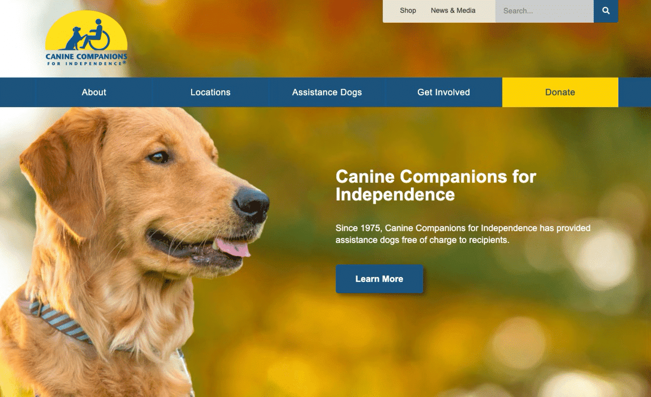
You should aim to draw visitors’ eyes to a picture of your candidate the same way this homepage draws visitors to its main attraction.
- Evoke emotion. As mentioned, hero images are meant to draw the eye and attract attention. However, they should attract attention to something specific and important for the website they’re featured on. For political campaign websites, hero images should evoke positivity, confidence, and other emotions that correspond with a candidate’s brand identity.
For an example of how to inspire awe, look at the American Air Museum in Britain’s homepage:

The bold angle and subject matter of the image give context for what the page is about while also inspiring a sense of wonder. Using a gradient overlay on images can also help with consistency and will brand your images to match your campaign’s colors.
All the images featured on your website should be high quality and professional. In some cases, this may require hiring a photographer to help collect photos that convey what makes your candidacy special.
2. Educate without overwhelming visitors.
Political campaign websites need to lay out a candidate’s platform in enough detail for voters to understand without bombarding them with information. Even if you have a lot to say about key issues (which you should!), create a better reading experience for your website users by:
- Keeping line lengths short. While we are perfectly capable of reading lines of text that stretch across an entire page, our brains prefer shorter line lengths, usually between 45 and 75 characters. Short line lengths encourage us to read through an entire page, making your information pages seem less dense.
- Using appropriate headers. Headers help your political campaign website’s visitors find the issues that matter the most to them. For single-issue voters, locating your candidate’s stance on a specific issue is their top priority, and clear headers streamline that process.
- Balancing text and images. It can be difficult to entice someone to read a block of text. Images should spark interest in what the text next to them says without distracting from the content.
Be sure to apply other key tenets of informational writing, such as avoiding overly technical language. Some voters may be experts, but a lot of them rely on your website to tell them everything they need to know.
3. Incorporate white space into your political website design.
Political websites need to communicate a lot of information quickly, including campaign updates, the candidate’s platform, and how to get involved. Remember, information is easier to comprehend when empty space separates sections of text. That’s why websites, books, and other reading materials have margins.
Overall, white space is the best tool available to a political website designer trying to break up complex passages that your website’s visitors will need a minute to process.
4. Keep your navigation simple.
While your political website design should be creative, navigation is not the place to experiment. Voters expect to find information quickly, so your site should follow standard UX practices rather than trying to reinvent the wheel.
To ensure constituents can find what they need, follow these navigation rules:
- Stick to standard placement. Always place a prominent menu bar at the very top of your site. This is where users naturally look first to find informational pages like “About” and “Issues,” as well as action-oriented links like “Get Involved.”
- Highlight the “Donate” button. Use a bold, contrasting color (like bright red) for your donation link to draw the eye and separate it from the rest of the menu.
- Order information strategically. While the menu should stay at the top, other elements can move based on priority. For example, a high-stakes campaign might place a subscription form above the fold, while others might feature it in the footer.
Ultimately, the goal of your political website design is to remove barriers between the voter and the action you want them to take. By keeping your navigation intuitive, you ensure that every visitor can find their way around without getting lost.
5. Create consistent branding across your political website.
Branding makes your campaign memorable. On the web, where judgments are made in seconds, your candidate’s visual identity acts as a shorthand that communicates values faster than words alone.
To ensure your political website design creates a unified identity, focus on defining these core elements:
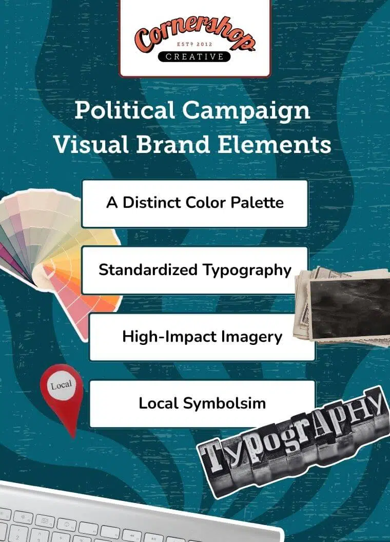
- A distinct color palette: Limit yourself to 2–3 colors (e.g., a primary blue and a contrasting “action” color for buttons that match your yard signs).
- Standardized typography: Select one bold font for headers and a clean, legible font for body text to maintain professionalism.
- High-impact imagery: Prioritize a high-quality “hero” image of the candidate and candid action shots over generic stock photos.
- Local symbolism: Incorporate state or community icons to visually align your campaign with the local culture.
Consistency builds trust. If you lack design expertise, use dedicated campaign web builders or work with consultants who know how to translate these elements into a cohesive digital experience.
6. Prioritize accessibility.
Web accessibility is important for all websites. But when you’re running a political campaign, the last thing you want to do is leave out a portion of your audience by ignoring accessibility standards.
You want all future constituents to be able to use your website as intended. If constituents are unable to access your website content, that sends a message about who your candidate will be as their representative. And it’s not a good message to send.
Beyond using a website builder that offers built-in accessibility tools, here are some quick tips you can implement:
- Add descriptive alt text. Ensure every image (especially photos of the candidate or infographics) has a text description so screen readers can explain the graphic to visually impaired visitors.
- Check color contrast. Text must stand out clearly against its background. For example, avoid light gray text on white backgrounds or red text on blue, which can be unreadable for those with color vision deficiencies.
- Caption all video content. Provide closed captions or transcripts for campaign ads and speeches so deaf or hard-of-hearing constituents receive your message.
- Label form fields clearly. Ensure your donation and volunteer forms have clear labels (not just placeholder text inside the box) so screen readers can tell users exactly what to type.
For the best results, follow the Web Content Accessibility Guidelines (WCAG), which are international standards for digital content. Prioritizing accessibility as you’re creating your political campaign website will ensure everyone can take action by supporting your campaign.
7. Add useful content to your political website.
Constituents come to your website to learn about your political campaign and get a sense of what type of representative your candidate will be. This is all accomplished through the content on your website. Content helps you get your candidate’s name out there and direct supporters toward involvement opportunities.
Whatever information you want constituents to know should be on your website. You might create the following:
- Candidate Bio & Story: A personal narrative that connects your candidate’s background to their policy goals
- Issues Platform: Jargon-free explanations of where you stand on local and national topics
- Voter Resources: Critical utility information on how, when, and where to vote
- Endorsements: A dedicated section for testimonials from community leaders and organizations to build social proof
- Multimedia: Photo galleries and videos of the candidate in action to humanize the campaign
- Blog & News: A feed for press releases, event recaps, and op-eds to keep the site fresh and active
Content is an incredibly impactful part of your marketing plan. By consistently publishing high-quality information, you not only educate voters but also establish the authority and trust required to earn their votes on election day.
8. Follow search engine optimization (SEO) best practices.
Even the most stunning political website design will be ineffective if it doesn’t appear in search results. SEO helps you rank higher when voters Google your candidate’s name, ensuring they find your official platform rather than negative press or an opponent’s attack ads.
To ensure your campaign is visible to the voters searching for it, focus on these SEO fundamentals:
- Target the right keywords. Every page should be optimized for terms voters actually use, such as your candidate’s name, the office they are seeking, and their district (e.g., “Jane Smith for City Council District 9”).
- Optimize page titles and meta descriptions. These are the “ad copy” that appear in Google results. Make them punchy and descriptive to encourage clicks.
- Leverage local SEO. Incorporate the names of specific neighborhoods, towns, and regions within your district to capture local search traffic.
- Update content regularly. Search engines favor active sites. Publishing frequent blog posts or press releases signals to Google that your political campaign website is a relevant, up-to-date source of information.
By investing in SEO, you ensure that when voters look for answers, your campaign is the first thing they find.
Working With A Political Website Design Company
Partnering with a web design company to build your political campaign website allows your team to focus on running the campaign while web design experts handle the technical elements of your site.
At Cornershop Creative, we’ve built plenty of websites for political campaigns and politicians. We know how to create a political campaign website that works to accomplish your goals, and we’ll work with your team to make sure that the website serves as a tool for constituents to interact with your campaign.
Our team handles the technical heavy lifting so you can focus on the campaign trail. Our core design services include:
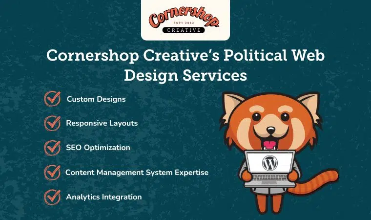
- Custom Designs: We create unique designs that reflect your candidate’s specific brand and resonate with target constituents.
- Responsive Layouts: We ensure your site offers a seamless experience on desktops, tablets, and mobile phones to maximize engagement.
- SEO Optimization: We implement best practices to boost your online visibility and help you rank higher in search results.
- Content Management System Expertise: We build sites on user-friendly platforms (like WordPress) that empower your team to update news, events, and announcements without needing technical expertise.
- Analytics Integration: We set up tools to track performance and user engagement, helping you measure the real-world impact of your digital efforts.
Like any other tool in your campaign’s arsenal, your website is an investment and will be key to your campaign’s success. While the cost of designing a political campaign website depends on the features and functionality you need, there are affordable options for every campaign. We’ll work with you to learn about your needs and deliver a custom quote.
Powerful Political Campaign Website Examples
As you’re thinking through designing your own political campaign website, don’t neglect to look to other campaign websites for inspiration. Having a few websites that you love (or don’t love) and notes on why to share with your designer will help them get a sense of your preferences and needs as they design your site.
These political campaign website examples are awesome for a range of different reasons. Explore each one to gather inspiration for your future political campaign website.
Congressman Brad Sherman
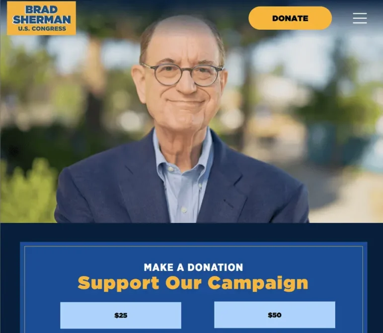
Congressman Brad Sherman’s website greets visitors with a friendly video banner showcasing the candidate interacting with different community members. The homepage places important calls to action front and center: to donate, sign up for communications, and learn more about his platform.
The simple website makes use of white space, helping to get all of the congressman’s most important information across, including his story, issues, endorsements, news, and contact information. Most importantly, it’s easy for his team to use and update as needed to share the most up-to-date information with constituents and donors.
Scott Schmerelson for Los Angeles District 3 School Board
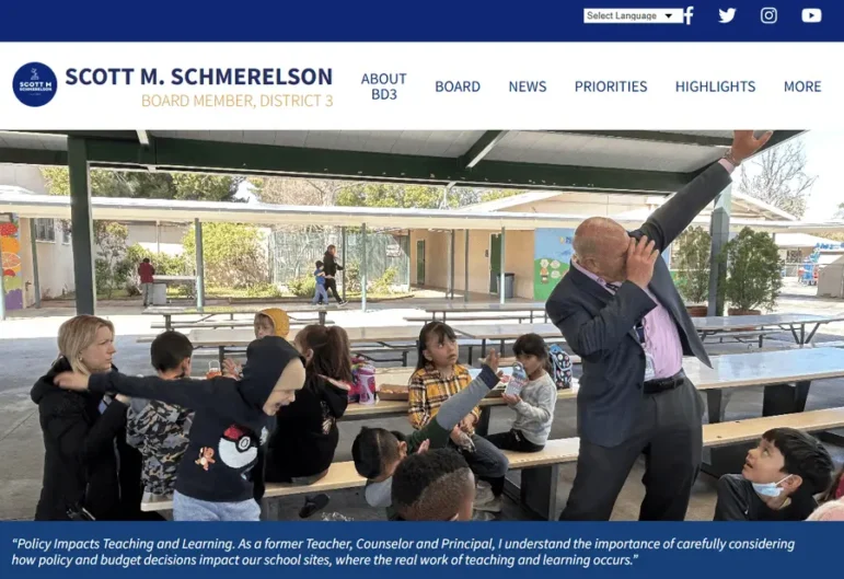
Scott Schmerelson’s political website is a prime example of intuitive navigation and interactivity. The menu clearly organizes must-know candidate information, board achievements, and the latest news, while offering visitors direct pathways to get involved with board meetings and initiatives.
Upcoming events are featured front-and-center on the homepage—as well as on a dedicated calendar page—ensuring supporters stay in the loop. Additionally, the site drives cross-platform engagement by integrating live social media feeds directly into the layout.
Jackie Goldberg for Los Angeles Unified School District Board
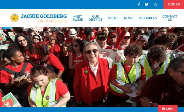
Jackie Goldberg is the former LAUSD Board President. Her campaign website opened in a burst of color that drew the eye straight to her in her bold hero image. The use of a limited color palette allowed the design to feel bold without overwhelming, giving the entire page an inviting appearance.
Her news page was especially well done, laying out blog posts with a mix of graphics and well-chosen photographs that provide variety without seeming inconsistent. This page also made good use of white space, which can be especially difficult to accomplish on news pages due to the sheer amount of updates that political campaigns need to publish.
Additional Resources To Power Your Political Website Design
As you get started on your own political website design, keep your campaign goals front and center. An engaging site actively works to catch (and keep!) voters’ attention.
While standard best practices like clear navigation and consistent branding are essential, your political campaign website requires special attention to core elements like your issues page, donation forms, and candidate identity. When done right, your site will serve as the ultimate campaign hub, giving voters the information needed to make a decision and the tools to get involved.
Looking for additional resources on creating your website? Check out these free guides:
- Nonprofit Website Maintenance: How To Keep Your Site Fresh. Learn how to maintain your political campaign website for the long haul and solve common issues, such as long load times, security, and mobile optimization.
- Nonprofit Website Builders: 16 Top Options to Choose From. How do you know which CMS to use to design your political website? Check out this comprehensive guide to learn about key considerations for selecting the right builder for your campaign.
- 15+ Nonprofit Web Design Best Practices to Drive Support. Want to build a site that truly engages voters? These political website design best practices will help you achieve the modern, professional look needed to capture attention and win support.