The best nonprofit websites offer eye-catching design elements, thorough educational information, tools for taking action, and a seamless user experience.
To make your own website one for the record books, one of the best things you can do before diving into design work is draw inspiration from the many amazing websites out there.
The examples we’ve rounded up are among some of the best nonprofit websites we’ve seen in our team’s many years of collective experience building websites for nonprofits. Let’s explore them together and also cover some web design basics:
- 12 Web Design Tips to Make Your Site One of the Best
- 35+ Incredible Nonprofit Website Examples
- The Key to Website Success: Work with Cornershop Creative
12 Nonprofit Web Design Tips to Make Your Site One of the Best
A lot goes into creating a beautiful and functional nonprofit website. Let’s review a few web design tips so that you’ll recognize them in action as you explore our showcase of top nonprofit websites below. Plus, you can use these tips when designing your own site!
1. Regularly review your website and make updates.
A website isn’t something that your team can set and forget. You’ll need to perform regular maintenance to ensure your site status is secure, user-friendly, and useful to your organization. This typically involves making website builder updates, refreshing your content, and fixing any elements that break.
2. Start by selecting a great website builder.
A website builder, also known as a content management system (CMS), is a content hosting platform that allows you to easily present, manage, and arrange content on a website without having to know any coding language. There are several options to choose from when selecting your website builder, but our favorite is WordPress. It’s a builder that enables you to thoroughly customize your site to match your brand, and because there are so many users, it offers an extensive support network.
Curious which website builders other nonprofits are using? Participate in our interactive poll to find out and receive personalized feedback on what to expect with each one.
3. Add a matching gift page.
Your nonprofit can raise exponentially more through matching gifts, and your website should highlight this fundraising opportunity to let donors know about it. Create a dedicated page on your website that provides an overview of matching gifts, brief instructions on how to participate, and an easy-to-use searchable database for donors to effortlessly check their eligibility.
4. Make donor acknowledgment easy.
To inspire support, your nonprofit must show donors the importance of their contributions. Simplify donor acknowledgment on your nonprofit’s website with donor-centric features, such as supporter testimonials, digital cards, and impact reports. This way, your website will demonstrate the importance of donors’ gifts and encourage them to continue giving!
5. Ensure quality performance.
47% of website visitors will leave your site if it takes more than three seconds to load. This is why speed is often the first thing people check on a site. If a site seems even a little bit slow, you can run it through GTMetrix for a performance report. You can also check your Core Web Vitals at pagespeed.web.dev.
6. Use a modern and fresh design.
You don’t want to build a site that looks like it could have been popular 10 years ago! Look for websites that use modern design tactics like breaking the grid to display images. Other modern design styles include larger images, modern typography, personalization, and subtle but effective animation.
7. Incorporate helpful imagery and iconography.
They say an image speaks a thousand words, and that is very true online. Even before a visitor reads a single word, they already understand volumes about your organization with the images and design displayed on your website. If your images and design don’t speak to your mission, your visitors won’t understand your mission.
8. Offer a clear presentation of your mission or purpose.
If visitors can’t tell what an organization does within the first few seconds of being on its homepage, they will often leave immediately. The best nonprofit websites feature a clear mission statement to communicate their purpose and connect with visitors.
9. Provide straightforward donation options.
Donations are key to any nonprofit organization, and 63% of donors prefer to give online. When looking at your nonprofit website, check to make sure that you can easily get to a donation form, that the form is well-branded and designed, and that it’s easy to complete. It’s a bonus if the website also includes other easy-to-use donation options, like an online store for selling branded merchandise.
10. Add easy-to-use navigation.
Once you get past the homepage, the most important part of a site is the navigation. If it’s difficult to understand, your site visitors won’t be able to find your content. Test this by asking yourself a few questions: How would I get to the blog? Who is on the staff? Do I understand what all the navigation labels mean? What services do they offer? Or how can I get help from their services? If you can’t complete a task, then the site needs navigation improvements.
11. Ensure the site works well on mobile devices.
Over 60% of website traffic comes from mobile devices like smartphones. The mobile version of the website shouldn’t feel like an afterthought but rather a unique experience for your mobile users. To ensure that your site is optimized for mobile, try testing it on your own device.
12. Optimize for accessibility.
Often overlooked, accessibility is key to ensuring that all visitors can access your website, regardless of disabilities and circumstances. Every site should be accessible and provide visitors with the best possible experience. Familiarize yourself with the Web Content Accessibility Guidelines and check how accessible your site is using a tool like Google Lighthouse.
What the Best Nonprofit Websites Have in Common
After designing and supporting hundreds of nonprofit websites, we’ve noticed a clear pattern. The best nonprofit websites don’t just look good—they make it easy for people to understand the mission, take action, and stay connected.
Here’s what the strongest nonprofit websites consistently do well:
1. They clearly communicate the mission.
Visitors should understand who you serve and why your work matters within seconds of landing on your site. Clear headlines and concise messaging build trust right away.
2. They guide users toward action.
Whether it’s donating, signing up, volunteering, or learning more, strong calls to action are visible, well-placed, and easy to complete.
3. They prioritize mobile and accessibility.
The best nonprofit websites are designed for real people using real devices. Mobile-first layouts and accessible design ensure everyone can engage with your content.
4. They tell compelling stories.
Impact stories, photos, videos, and testimonials help supporters see themselves in your mission—and understand the difference their support makes.
5. They use flexible, future-friendly technology.
A strong nonprofit website is built on a CMS like WordPress that allows teams to update content easily, launch campaigns quickly, and grow over time.
6. They feel cohesive and intentional.
Consistent branding, thoughtful layouts, and purposeful design choices signal credibility and professionalism—without sacrificing warmth.
If your website supports these fundamentals, you’re already on the path to creating a standout nonprofit digital presence.
35+ Incredible Nonprofit Website Examples
Let’s dive into our list of the best nonprofit website examples out there. As you explore these websites, note features and best practices that you want to implement on your own site!
Here’s the full rundown of the types of sites we’ll be looking at:
- Best Nonprofit Websites for Medical Missions
- Best Websites Focused on Sustainability
- Best Educational Nonprofit Websites
- Best Websites for Nonprofits Focused on Children
- Best Websites for the Arts
- Best Websites for Human Rights Organizations
- Best Websites for Religious Nonprofits
- Best Nonprofit Websites for Promoting Community Stability
Best Nonprofit Websites for Medical Missions
Nonprofits with medical missions need websites that communicate their compassion, impact, and powerful work. If your nonprofit is in the medical field, check out these websites for inspiration!
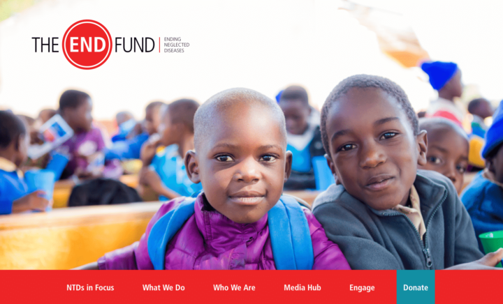
The END Fund
The END Fund is an organization dedicated to delivering treatments for neglected tropical diseases in a variety of African countries, Yemen, Afghanistan, India, and China.
What We Love About This Website
The END Fund’s custom WordPress website reflects the importance and impact of their work with powerful stories peppered into content throughout the site. You’d be hard pressed to find a page on their site without a story! Plus, the move to WordPress with a fresh, bold, engaging design allows their team to spend less time managing their website and more time working to end neglected tropical diseases.

Lymphoma Research Foundation
The Lymphoma Research Foundation is on a mission to find a cure that eradicates lymphoma and serve those affected by the disease.
What We Love About This Website
This website is packed with resources for their strong community of patients, researchers, and health professionals. We also love their bold purple branding that’s applied consistently across the site.

Sharsheret
Sharsheret is a Jewish cancer organization that supports those facing breast cancer or ovarian cancer by providing community and financial assistance for cancer treatments.
What We Love About This Website
Sharsheret’s custom-designed WordPress site uses photos and interactivity to provide resources and support to women, families, and communities affected by breast and ovarian cancer. Easy for visitors to use and navigate, there are multiple ways for site visitors to contact the Sharsheret team, including live chat.
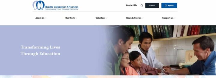
Health Volunteers Overseas
Health Volunteers Overseas works in resource-scarce countries to improve healthcare by providing education, training, and professional development to healthcare workers.
What We Love About This Website
The Health Volunteers Overseas website cuts out the noise and gets straight to the point, which their audience of busy healthcare professionals appreciates. The clean and simple design puts the focus on their work and community of volunteers.
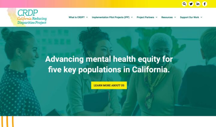
California Reducing Disparities Project
The California Reducing Disparities Project is a culturally responsive mental health initiative serving African American/Black, Asian Pacific Islander, Latino/Latinx, LGBTQ+, and Native American communities.
What We Love About This Website
This nonprofit website serves as a resource and networking hub. The site makes a strong statement with its use of colors and effects. As a bonus, it’s flexible enough to grow with the organization as it evolves.

Ophthalmology Foundation
The Ophthalmology Foundation partners with eye care professionals, societies, and organizations to provide ophthalmic education, especially in underserved communities.
What We Love About This Website
This organization’s website features a new logo that reflects organizational changes. On the new site, donors can easily give thanks to an intuitive form, and on the backend, those donations are processed through Stripe and donor information is automatically stored in Salesforce. The cherry on top is a matching email template for MailChimp so they can keep in touch with their constituents in style.
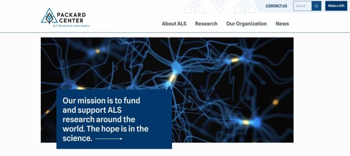
Packard Center for ALS Research
The Packard Center supports ALS research around the globe.
What We Love About This Website
The Center’s website is the picture of clean and modern web design. The use of white space and interesting, yet intuitive layouts keep visitors engaged on the site. Research and news updates are front and center, keeping their audience up to date on the latest in ALS research.
Cornershop Creative has helped create 150+ nonprofit websites…and we can help with yours, too!
Best Nonprofit Websites Focused on Sustainability
Environmental nonprofits need web design that uniquely represents their efforts toward sustainability. Inspire support and raise awareness by using these powerful websites as examples to design your own!
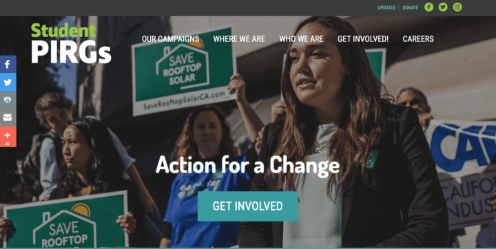
Student PIRGs
Student Public Interest Research Groups (PIRGs) brings students together over issues like renewable energy, homelessness, voter mobilization, and deforestation.
What We Love About This Website
The new Student PIRGs sites are not only beautiful, but they’re also much easier to use! Action Network forms are embedded throughout the sites for fundraising, and content is syndicated from the national level through to states, where organizers can then manipulate some of the content as needed. Thanks to WordPress multisite, the Student PIRGs team can spin up a well-branded chapter site in moments to more quickly connect with student activists and volunteers at the local level.
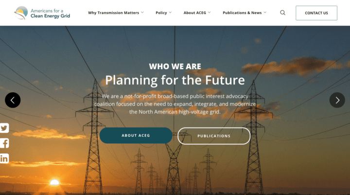
Americans for a Clean Energy Grid (ACEG)
ACEG advocates for the expansion, integration, and modernization of the North American high-voltage energy grid.
What We Love About This Website
Their website has a clean, modern feel that showcases their reports and research in a way that’s both accessible and appealing. The simplified information architecture makes the site user-friendly and fun animated elements add interest to key pages.
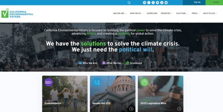
California Environmental Voters
California Environmental Voters is working to solve the climate crisis, build thriving communities, and create a sustainable democracy and economy.
What We Love About This Website
This nonprofit’s website does a great job showcasing their work, celebrating their impact, and presenting opportunities for visitors to get involved. Strategic calls to action abound throughout the site!
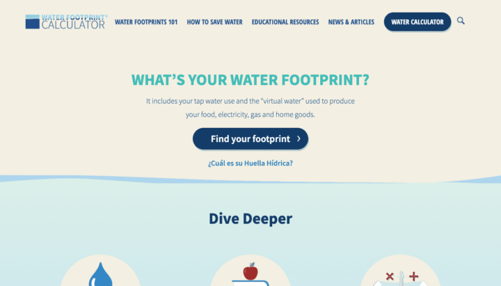
Water Footprint Calculator
The Water Footprint Calculator website is built around its user-friendly calculator tool that helps people understand and improve their water usage habits.
What We Love About This Website
The site also includes tons of other resources that are more accessible for users on the new site. The updated website supports 79% more site entries through their Spanish content and thousands of visitors accessing their new resource pages.
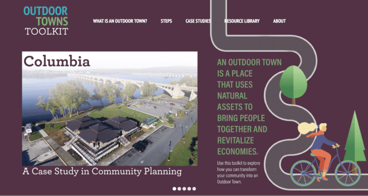
Outdoor Towns Toolkit
The Outdoor Towns Toolkit is a project by the Pennsylvania Environmental Council. This top nonprofit website is intended for self-motivated communities that want to take steps to make their towns great places to live and explore the outdoors.
What We Love About This Website
This website differs from many nonprofit sites in that it isn’t built on “calls to action” for donations or list sign-ups — rather, it’s designed to guide users through all the steps of creating a town that supports outdoor activities. The custom site has a clear flow of content and beautiful illustrations built into its interactive design.
Cornershop Creative has helped create 150+ nonprofit websites…and we can help with yours, too!
Best Nonprofit Websites for Educational Organizations
Raise support and drive donations for your educational institution by building a website around your mission. Use the following websites as examples to guide your design.
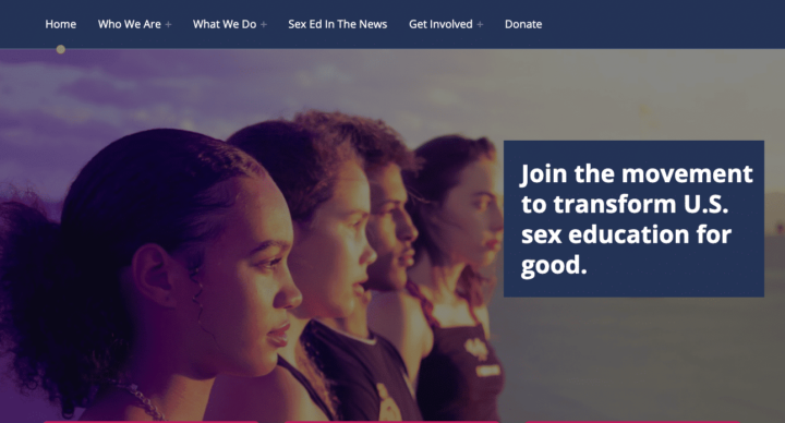
EducateUS
EducateUS advocates for comprehensive public sex education across the country in order to liberate LGBTQ+ communities, end gender-based violence and child abuse, and fight white supremacy.
What We Love About This Website
The accessible and SEO-friendly EducateUS website has kept up with the organization’s rapid growth. The fresh and colorful website features plenty of white space, attention-grabbing calls to action, and great imagery. Integrated with EveryAction and armed with Gravity Forms, the site will support their future endeavors, with room for growth in both information-gathering and communication efforts.
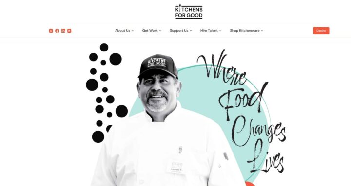
Kitchens for Good
Kitchens for Good is a San Diego-based nonprofit that offers culinary, baking, and hospitality apprenticeship programs to help individuals with barriers to employment prepare for and find fulfilling jobs in the food and hospitality industry.
What We Love About This Website
The organization’s website combines black-and-white photos with fun and colorful graphic design for a unique and appealing design that puts their community members at the forefront.
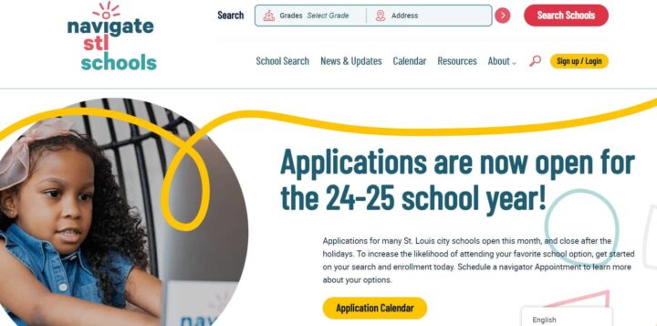
Navigate STL Schools
Navigate STL Schools is a St. Louis-based nonprofit that helps local families learn about their school system and navigate their school options.
What We Love About This Website
This nonprofit website is designed to take parents through the entire journey of selecting, applying for, and starting their kids at a new school. Custom features to search and compare favorite schools, view upcoming events on an interactive calendar, and more provide an awesome experience for their audience.
Cornershop Creative has helped create 150+ nonprofit websites…and we can help with yours, too!
Best Websites for Nonprofits Focused on Children
Organizations with missions surrounding youth and children are sure to find inspiration in these fun, engaging, and celebratory designs. Let the following examples inspire kid-friendly web design!
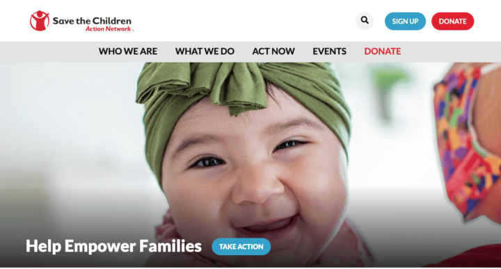
Save the Children Action Network
Save the Children Action Network (SCAN) is the political advocacy arm of Save the Children and is devoted to being the political voice for kids through grassroots activism.
What We Love About This Website
SCAN has a beautiful site that’s clean, engaging, and full of this organization’s wonderful stories. Integrated with Salsa, the site can easily collect email sign-ups, create petitions, and gather event RSVPs. Plus, content feeds throughout the site mean that articles, issues, and content are shared automatically without extra work on the part of the staff.

Child Development Services of Fremont County
Child Development Services of Fremont County (CDSFC) partners with families to meet the developmental needs of children of all abilities from birth to five years of age.
What We Love About This Website
This organization’s website presents their services and programs in a welcoming and kid-friendly way. Cheerful colors and images of the children and families they serve create a site that is both helpful and a joy to use.
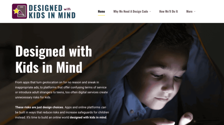
Designed with Kids in Mind
Designed with Kids in Mind is a coalition of organizations dedicated to creating a design code that ensures the well-being of children and internet users all across the US.
What We Love About This Website
The website is full of educational content that clearly lays out the case for supporting the coalition’s goals. In addition to this information, sleek branding and images come together to deliver a lively, modern website. Plus, reusable blocks and patterns can update and grow the website into the future.
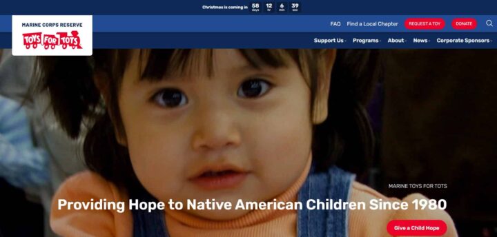
Marine Toys for Tots
Marine Toys for Tots collects and distributes toys to economically disadvantaged kids at Christmas.
What We Love About This Website
Aside from a cheerful design to show off their mission and heartwarming photos, the new Marine Toys for Tots website is packed with helpful features for their expansive community. From embedded maps to pinpoint local chapters to translation tools to interactive timelines, the new Marine Toys for Tots website pulled out all of the stops to create an engaging experience for visitors.
Cornershop Creative has helped create 150+ nonprofit websites…and we can help with yours, too!
Best Nonprofit Websites for the Arts
Visual appeal is proven to increase engagement with online content, which is why your arts-focused nonprofit should infuse its website with creativity. Let the art do the talking and check out the following examples to see how other websites accomplish this!
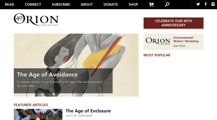
Orion Magazine
Orion Magazine is a longstanding publication known for its beautiful print magazines, rich with poetry, prose, and photography.
What We Love About This Website
The magazine’s website lives up to its beautiful paper counterpart. Their beautiful new, mobile-responsive WordPress site is rich in visual enhancements. Six custom content types maximize editability and create a memorable reading experience for the magazine’s many followers.
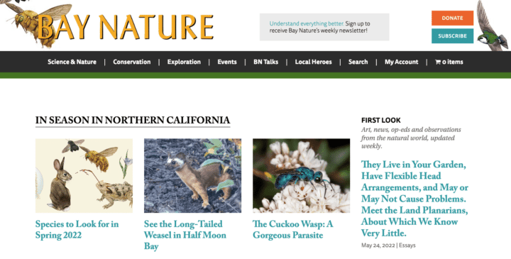
Bay Nature
Bay Nature is an independent nonprofit publication that connects people of the San Francisco Bay Area to the natural world.
What We Love About This Website
The publication’s website takes our relationship with nature seriously, and the site reflects that. Custom WordPress post types and future-focused page layouts help create an information architecture that highlights key articles, integrates their WooCommerce subscriptions, provides a robust events calendar, and integrates their photo and video galleries and social media activity. The site also includes custom features for ads, products, and multiple blog authors.

Powerhouse Arts
Powerhouse Arts connects artists to each other and the resources needed to express themselves.
What We Love About This Website
This organization’s website is clean, sleek, and modern. The black and white color scheme provides strong visual contrast and the unique page layouts make reading Powerhouse Arts’ content quick and easy.
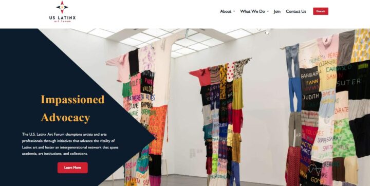
US Latinx Art Forum
The US Latinx Art Forum advocates for Latinx artists and art professionals engaged in research, studio practice, pedagogy, and writing.
What We Love About This Website
The Forum’s site puts community art front and center on their site, letting their artists speak for themselves. We love the mix of light and dark in their color palette, as well as the intriguing shape of internal page headers.
Cornershop Creative has helped optimize 600+ nonprofit websites…and we can help with yours, too!
Best Nonprofit Websites for Human Rights Organizations
Sending out friendly and approachable vibes is important for organizations looking to build community and then represent those communities. Your website design is a key tool to set the tone for your organization as a whole and send out all the right vibes.
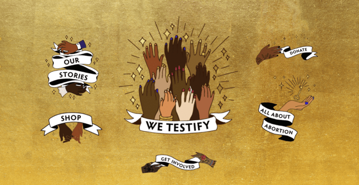
We Testify
The National Network of Abortion Funds (NNAF) launched the We Testify campaign as a storytelling platform that shares abortion stories as diverse as the women who seek them.
What We Love About This Website
Story posts are front-and-center and site visitors are encouraged to share their own stories through a customized Gravity Form. The form collects submissions and automatically creates draft WordPress posts for further vetting and publishing by NNAF staff.
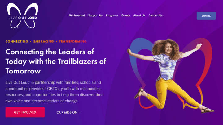
Live Out Loud
Live Out Loud empowers LGBTQ+ youth by creating safe, inclusive, and affirming educational environments.
What We Love About This Website
This nonprofit website is modern and fun, with a special focus on its youthful audience. A colorful donation form, built with Gravity Forms, can be embedded on any page of the website and shared easily.

GLAD Law
GLBTQ Legal Advocates & Defenders (GLAD Law) works to create a discrimination-free society through litigation, public policy advocacy, and education.
What We Love About This Website
The organization’s website is intuitive, user-friendly, and designed to encourage meaningful action from visitors. Right off the bat, visitors are presented with educational information and multiple ways to support their mission and join in their cause.
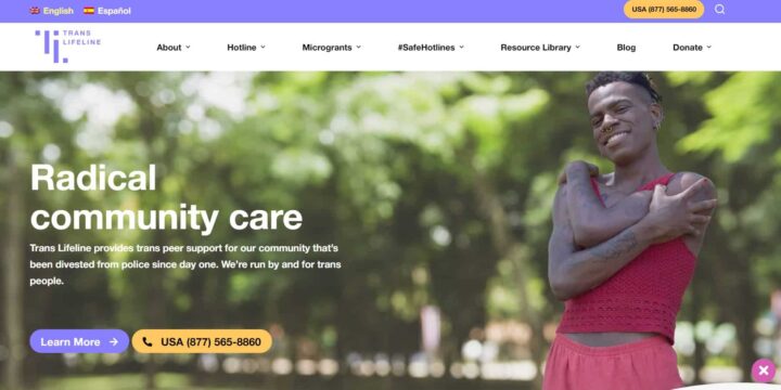
Trans Lifeline
Trans Lifeline is a nonprofit run by and for trans people that offers emotional and financial support for trans people who are in crisis.
What We Love About This Website
This top nonprofit website was designed to be as accessible as possible to their audience. The custom functionality that enables visitors who aren’t ready to share their identity with others to close out the website at a moment’s notice is especially useful and unique.
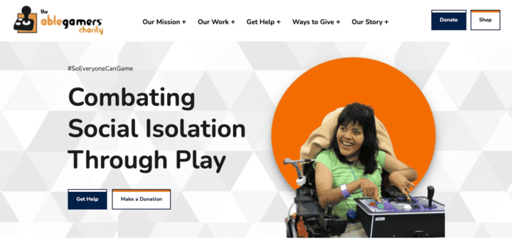
AbleGamers
AbleGamers strives to create opportunities for playing video games to help combat social isolation, create inclusive communities, and improve quality of life for those with disabilities.
What We Love About This Website
The AbleGamers website is action-oriented, but it puts accessibility first. Using the Bjork WordPress theme, which has great accessibility features built-in, the site also went through a full accessibility audit and implementation prior to launching to ensure all features and content were accessible for their entire audience.

Peace is Loud
Peace is Loud puts a spotlight on storytelling by women, trans, nonbinary people to educate others about social justice issues.
What We Love About This Website
Peace is Loud built their new website with the goal of better featuring their stories and the impact of their work. The result is a site that connects speaker and film content and showcases their speakers bureau beautifully. Supporters can now connect with Peace is Loud work online and bring changemakers to their own communities. Plus, faceted search features allow for easy navigation throughout the site.
Cornershop Creative has helped create 150+ nonprofit websites… and we can help with yours, too!
Best Websites for Religious Nonprofits
As a faith-based organization, your nonprofit’s website must be welcoming yet educational, and also encourage action! See how the following websites meet all of these design needs and more.

Interfaith Alliance
Interfaith Alliance works to create powerful alliances between people of different faiths and build an inclusive and resilient democracy.
What We Love About This Website
The Alliance’s website reflects the vibrancy and modern relevance of its work. To tap into their engaged audience, the site is geared toward inspiring action with custom calls to action, social media sharing features, and content organization that highlights and prioritizes the many important campaigns they create.

Bible Odyssey
The Bible Odyssey website exists to help people better understand the content in the Bible, taking an academic approach that’s as serious as its realm of study.
What We Love About This Website
The website’s clean and easy-to-navigate design puts all of the focus on the content itself, helping users explore and take in the wealth of resources on the website. Helpful research features, like a tool that allows users to search the text of several different Bibles and compare the results side by side and a feature that dynamically loads Bible passage tooltips related to the content, are seamlessly integrated into the design.
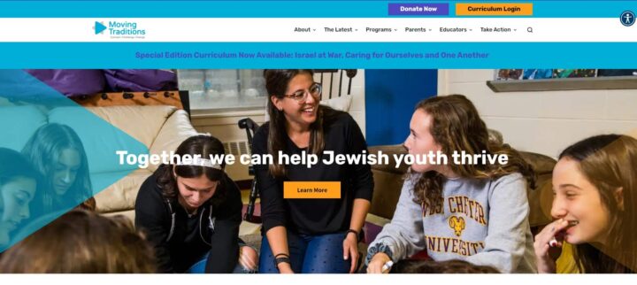
Moving Traditions
Moving Traditions is known for working hard to provide tools and programs that embolden Jewish youth and strengthen families.
What We Love About This Website
This organization’s youth-friendly website has a bright color scheme and a robust menu to keep its content organized. It was user-tested and has proved to be an approachable and useful tool for their young audience.
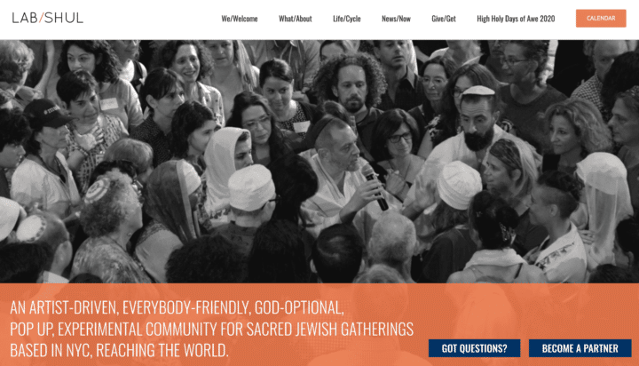
Lab/Shul
Lab/Shul offers fun, fresh, “everybody-friendly” sacred Jewish community gatherings.
Why We Love This Website
This vibrant and modern website brings Lab/Shul’s mission to life, showcasing their projects and events. The grayscale images and the bright orange contrast color make this an amazing site that you can’t look away from.
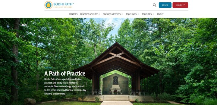
Bodhi Path Buddhist Centers
Bodhi Path Buddhist Centers is an international organization of Buddhist centers that provide authentic Buddhist teachings in a contemporary manner.
What We Love About This Website
The peaceful atmosphere of Bodhi Path carries through on their website. The user-friendly site offers a welcoming and calming experience to visitors interested in learning more about the centers and their teachings.
Let’s create a standout nonprofit website that captures attention and drives action!
Best Nonprofit Websites for Promoting Community Stability
If your nonprofit works to enhance its community, you’ll need a strong supporter base to push you toward your goals. Get other community members on board with an inviting website, like the following examples!

Penny Appeal USA
Penny Appeal USA is an organization dedicated to poverty relief that provides water solutions, mass feedings, orphan care, and medical aid to communities around the world.
What We Love About This Website
The organization’s website is the epitome of a friendly, welcoming design. The site uses Blocksy and Elementor Pro, a WordPress builder that helps content creators build new layouts and update content quickly to help the team stay on top of urgent updates. To take advantage of the friendly design, a custom Elementor widget connects to their Springboard donation forms, allowing donors to give to a range of programs and appeals.
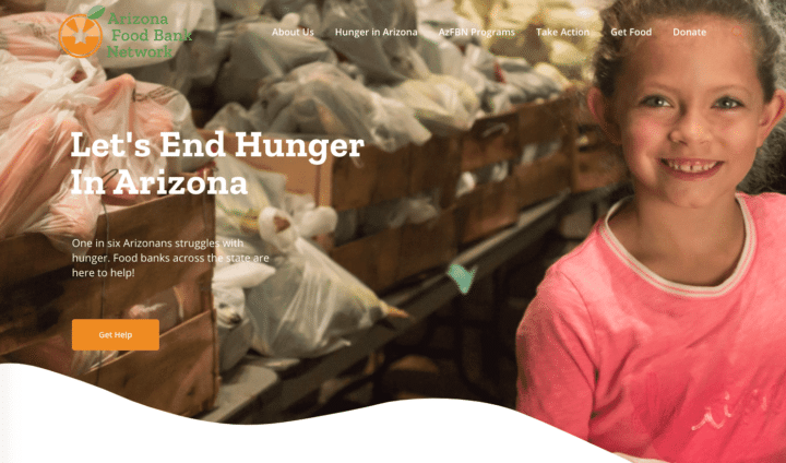
Arizona Food Bank Network
The Arizona Food Bank Network (AzFBN) is a coalition of regional food banks and food pantries that work to address hunger in the state of Arizona.
What We Love About This Website
AzFBN refreshed its website with updated branding and improved usability through map features and an organized sitemap. The new website works to uplift the good work of their food bank network by raising awareness about hunger, coordinating large food donations between food banks, and providing resources and education.
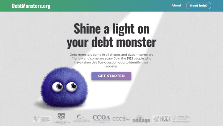
Debt Monsters
Smart Growth America’s Debt Monsters is a simple WordPress site with a debt quiz that uses zip code search functionality to connect people to their respective debt management agencies.
What We Love About This Website
Adorable monster illustrations throughout the website help to make the uncomfortable topic of debt a little more approachable, help to make this uncomfortable topic a little more approachable. And once you complete the quiz you receive personalized recommendations for next steps to tackle your debt problems.
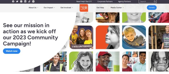
United Way of Greater St. Louis
The United Way of Greater St. Louis works to mobilize its community and help people live their best lives.
What We Love About This Website
This organization wants to appeal to the whole diverse St. Louis community and their fun, user-friendly website design does just that. We love how easy they make it to find help and see their impact.
The Key to Website Success: Work with Cornershop Creative

Cornershop Creative is a website design agency that helps nonprofits, small businesses, and political campaigns make the best of the web. We’re experts in WordPress and can handle the heavy lifting of designing and maintaining a custom site for your mission.
Here are some of our core services:
- Custom WordPress website development
- Website hosting, support, optimization, and maintenance
- SEO & content strategy
- CRM & campaign implementation
- Google Ads management
We can help you create the site of your dreams, taking the heavy lifting off your shoulders so that you can focus on making a difference for those you serve.
But don’t just take our word for it! Check out what a few of our clients have to say about working with us:
- “Cornershop Creative was a very corroborative and responsive partner. Their knowledge of the WordPress platform helped us to better define and achieve our goals. We couldn’t be happier with the final result!” – Avalon Consulting
- “Cornershop is unmatched in their professionalism and always delivers quality products in a timely manner. We couldn’t recommend them more!” – Center for Earth Ethics
- “Cornershop did a great job rebuilding our website. They helped guide the direction of the project while also staying true to my vision. We had to adjust the timeline and they were always accommodating and communicative. We are so pleased with the end result!” – Dance Studio-Pro
Is it Time to Redesign Your Nonprofit Website?
Even the best nonprofit websites need a refresh eventually. If you’re not sure whether it’s time for a redesign, these signs can help you decide.
1. Your website feels outdated.
If your site looks like it hasn’t changed in years, visitors may assume your organization hasn’t either. Modern design helps communicate relevance and credibility.
2. It’s difficult to update content.
If your team avoids making updates because the CMS is confusing or time-consuming, your website isn’t working for you.
3. Mobile users struggle to navigate the site.
4. Your site isn’t accessible.
Accessibility gaps can prevent people from engaging with your mission and create unnecessary barriers for users with disabilities.
5. Conversions are lower than expected.
If visitors aren’t donating, signing up, or taking action, your website may not be guiding them clearly enough.
6. Your goals have evolved—but your site hasn’t.
As your programs, audience, or strategy change, your website should evolve with you.
If any of these feel familiar, a nonprofit website redesign could help you better serve your audience and amplify your mission.
Bonus Resources to Supercharge Your Nonprofit Web Design
Ready to make your nonprofit website one of the best? It’s time to work with a nonprofit web design company. For help elevating your website like the ones on this list, reach out to our team at Cornershop Creative using the form below! And to continue learning about how to create a stand-out website for your nonprofit, explore the following additional resources from the Cornershop blog:
- Top Nonprofit Web Design Companies To Boost Your Reach
- Google Analytics for Nonprofits: The Ultimate Guide
- SEO for Nonprofits: A Playbook to Greater Organic Visibility
- Nonprofit Website Builders: 16 Top Options to Choose From
- Nonprofit Website Maintenance: How to Keep Your Site Fresh
- Build a Nonprofit Marketing Plan: Full Guide & FREE Template