Your website is one of the most important tools your nonprofit has. It introduces your mission, supports fundraising, and helps people understand how they can get involved. Yet many organizations face real challenges: limited budgets, crowded digital spaces, and the growing need to turn their website into a reliable fundraising and engagement engine.
The good news? With the right approach, your website can attract new supporters, keep your community engaged, and make it simple for people to take action. With a clear structure, strong accessibility, and well-organized content, your website can show up where supporters are looking, whether using a search engine or AI tool.
This guide walks through the best nonprofit web design best practices to help you build a site that not only looks great but also drives visibility, growth, and engagement.
Does this sound like too much for a website to accomplish? Many nonprofits already have websites that are doing all this and more!
Get started attracting and engaging the audience you are looking for!
Partner with Cornershop Creative for a custom nonprofit website that builds trust and inspires action.
1. Build a website that you can maintain.
A great website takes a lot of planning and effort to build and maintain. Unless your organization has a team of developers on staff, you will want to choose a content management system (CMS) that helps you with all that work.
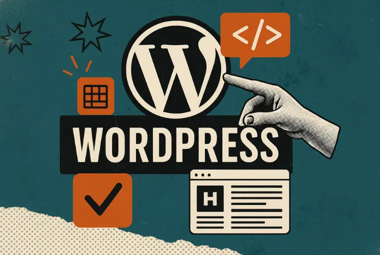
Currently, the most popular CMS is WordPress. This is because it is relatively easy to use, offers (almost) unlimited functionality and design variety, and is simple to maintain once you know the steps involved. There is a bit of a learning curve when starting out, but it is definitely worth learning if you plan to update and maintain your website yourself.
Other well-known CMSs include Wix, Drupal, and Squarespace. Though these aren’t as popular as WordPress, they can offer the benefit of making it easy to build and update a website for your organization.
Whatever CMS you choose, you will need to perform regular maintenance on your website to keep it healthy. Some things to check are:
Basic Functionality:
Test your forms, menus, links, and videos every few months to make sure everything is working and looking as it should.
Content Updates:
No matter how big your website is, you will want to update your content and add new information often, ideally at least once a month. Check the content on your main pages to make sure they still have accurate information like impact numbers and dates. Write new blog posts often and add new pages as needed to describe new programs or initiatives.
Security Updates:
Make sure you are maintaining current HTTPS certificates, updating software (and plugins on WordPress), and paying attention to security alerts from your hosting servers.
Get Help When you Need It:
Sometimes things happen to websites that seem impossible to fix if you are only familiar with the basic functions of the website. Don’t be afraid to ask for help when you need it. The costs of hiring a consultant are often completely worth it when compared to the stress, cost, and time of trying to do everything yourself in addition to all your other work.
See This Nonprofit Design Tip in Action

The Aspen Community Strategies Group website has a great design built with longevity in mind. The website is built in WordPress and features security plugins, making it easy to maintain over time. The posts and pages use replicable templates for easy content updates.
2. Optimize your nonprofit website for search engines.
Good search engine optimization (SEO) takes a lot of time and effort to maintain. And it’s worth every second you put into it! Your website should be a hub for your faithful supporters and an outreach tool to find new ones. Unfortunately, if your website doesn’t appear on the first page of search results, most searchers will never see it.
You will be happy to know that most of the nonprofit web design best practices in this article actually help your SEO. This is because, according to Google, the most important thing to remember for awesome SEO is to have a well-written website that provides helpful information and a great user experience.
Here are some easy SEO tips that you can put into action right away to improve your SEO:
Write relevant, helpful content that answers questions for your audience:
Content is the main factor in determining page rank, so you want to make sure you are writing content that your target audience is looking for. It is also important to fact-check your information and update statistics as often as needed so you can be known as a trusted source of information.
Do keyword research and optimize your pages:
Keyword research is a helpful tool when planning and writing content since it can show you what people in your target audience are already looking for. Start your search with the main services you offer or the principles you advocate, then see what other suggestions come up. Pay special attention to questions in the list since answering those questions is the perfect way to pick topics for future blog posts.
Update your content at least once a month :
After a while, websites that aren’t updated will be reduced in rank because they are considered inactive. Make sure to update your content regularly with new blog posts, updated statistics, and new impact information.
Promote your website on social media:
Your content marketing strategy should include social media posts that promote your efforts and refer people to your website. The increased traffic and attention for these referring websites will help to raise your overall SEO rankings.
Always redirect pages you have moved or deleted:
If you delete a page on your website or move it by changing the URL, make sure you add a redirect. A missing page produces a 404 error, and too many of those will have a very negative impact on your overall website rankings.
For more tips and helpful information on optimizing your nonprofit website for search, read our guide to SEO for Nonprofits.
But wait, that’s not all!
With the changing search landscape, it’s more important than ever to optimize website content for SEO and AEO/GEO (Answer Engine Optimization/Generative Engine Optimization).
Search engines and AI tools look for clear structure and well-organized content. When pages are easy to skim, they perform better in search and support readers with different learning styles.
Use these AEO/GEO best practices to boost AI visibility:
- Use short headings that match what people search for.
- Start each page with a short summary.
- Break long paragraphs into simpler pieces.
- Answer common questions your audience asks.
Strong content structure helps both people, and search engine tools, find what they are need quickly and accurately.
See This Nonprofit Web Design Tip in Action

Americans for a Clean Energy Grid recently did a ton of work rewriting and updating their website to showcase their mission. The website provides a fantastic user experience and the content is streamlined, readable for a wide audience, and accessible.
3. Step into your supporters’ shoes and create a user-friendly site.
Attention is fleeting online. If your website loads too slow, is hard to navigate, or offers another poor user experience you are likely to lose viewers before they ever get the chance to donate. The average user isn’t going to want to work to find the information they need on your website, so they’ll just go somewhere else instead.
Just like SEO, there is a lot that goes into providing a good user experience, and most of the major factors are covered in depth in the sections of this guide. The main thing to remember is that your nonprofit web design should be about your audience, not about your organization. Learn as much as you can about your audience and include treats in your design that they will appreciate. Here are a few needs that all audiences share to get you started:
Smooth and Easy Navigation:
Help your audience find what they need on your website by providing clear navigation. Avoid cluttering your navigation with too many choices, though, since that can be confusing to your supporters.
Make it Visually Interesting:
Break up your blocks of text so the site is easy to skim, and use headings to establish informational hierarchy. You should also add colorful buttons, interesting graphics, and high-quality photos.
Guide Them on a Journey:
Help direct your audience through your website with plenty of internal links, calls-to-action, and reading suggestions.
Help Them Take Action Online:
Donations, events, and all information-gathering forms should be easy to use right on your website, even on mobile. Make sure that you provide a way for your audience to complete whatever action you are asking of them. If you are using WordPress as your CMS, there are plenty of helpful plugins you can use for this!
Focus on Accessibility and Security:
Every person online wants to feel included and safe, especially when making digital donations. Ensure your website meets these needs by making it accessible and implementing security fixes as soon as possible.
See This Nonprofit Web Design Tip in Action

The website for Tony La Russa’s Animal Rescue Foundation (ARF) provides a great user experience with clear navigation, optimized pages, and a vibrant interface. They even offer plenty of educational content to answer the questions their audience is asking, even when the topic is not something they directly help with.
4. Prioritize website security.
Personal information is a big commodity in this digital world, so you should take steps to make sure your website is as secure as it can be. A secure website protects you and your audience from fraud and cyber attacks that could cause major harm. To protect your website:
- Insist on a high-quality, secure server.
- Make sure team members are using secure passwords to manage your website.
- Enable two-factor authentication.
- Update your software and plugins (on WordPress) regularly.
- Only use secure payment processors to accept donations.
Another thing you should do to ensure your audience that they are safe on your website is to publish your privacy policy on your website. Let them see exactly how you will be using the information they provide, how the information will be stored, and your intentions around sharing or selling their information.
See This Nonprofit Web Design Tip in Action

Penny Appeal Canada presents the best of all worlds with bold, exciting donation forms that offer plenty of choices for making secure payments.
Discover how Penny Appeal Canada built donor trust with secure, user-friendly web design.
5. Make sure every element on the site is accessible for all visitors.
Web accessibility is essential and should always be a top priority for all nonprofit websites. It ensures that everyone can use your site, and it improves search visibility.
WCAG 2.2 includes updated guidance around focus styles, target sizes and navigation. These changes matter for nonprofits because your audiences vary widely in age, ability, and device use.
Follow these rules to make your nonprofit website design more accessible:
- Provide more than one way to understand your content. This includes adding alt text to images and transcripts for videos.
- Don’t rely on color alone. Everything on your website should have more than one indicator of importance. The best example of this is links. Underlining links as well as showing them in a different color offers more opportunities to identify them.
- Enable keyboard navigation for the entire website. Ensure that the visitor doesn’t have to be using a mouse to use your website.
- Use high-contrast design and large fonts. Some colors may look pretty together, but prove to be hard to read online, especially for anyone with a visual impairment. Make sure the colors you use are contrasting enough to be seen, and that your fonts are no smaller than 16px.
- Use headings to give your pages a clear hierarchy. Pages should be organized by headings with one H1 at the top, followed by subsections labeled with H2, and any smaller subsections tagged H3, and so on.
- Use labels and helper text outside form fields. This text stays visible even after the users start typing and makes your forms more accessible.
- Use helpful, descriptive text for links. This will show your visitors where the links lead and help them understand the difference between the links on the page.
We can help you monitor your web accessibility and ensure compliance with ADA and WCAG standards, allowing you to stay ahead of legal requirements and enhance user experience.
See This Nonprofit Web Design Tip in Action

The National Network of Abortion Funds regularly works to improve the accessibility of its website to make sure they are available to anyone who needs their help. They recently underwent subtle upgrades to improve font sizes, contrast, and navigation with the goal of ultimate accessibility.
6. Optimize your site for mobile visitors.
The world has gone mobile—can your website keep up in such a busy world?
On average, about half of your website visitors will be using a mobile device. Did you know that people read (and retain) about 50% less on mobile? This is because they are usually multi-tasking while they are browsing your site. You need to make it as easy for them as possible to make that 50% attention span count.
Luckily, website builders are making it easier to optimize your website for mobile viewing. You should make sure your website is built in a way that accounts for mobile and can adapt to different screen sizes. On top of that, here are a few more tips for providing a great mobile experience:
- Ditch the Carousel: Content carousels (aka sliders) are a fun idea since they allow you to put more content in a smaller package, but they are really bad for mobile devices. Many times the viewer only gets to see one slide in the carousel, and it is often warped or so large that it requires users to expand their view to read it. This is not making things easy for them!
- Watch Your Image Sizes: Larger images take longer to load and can be a hindrance to a good mobile experience. Make sure the images you use on your website are only as big as they need to be.
- Program Breakpoints for Mobile Stacking: Content elements, like paragraphs, columns, cards, and images should stack on top of each other on smaller screens so that users don’t need to side-scroll to read your content. By programming your breakpoints, you get to control how the stacking looks on each screen size.
- Use Buttons Instead of Links: Buttons are easier to click on mobile than text links. Use buttons for all your important calls-to-action so that it is easy for users to take the actions you want them to.
- Test on Different Devices: After you’ve done all the setup, make sure to test your website across multiple devices and browsers to ensure that they all look the way you want them to.
See This Nonprofit Web Design Tip in Action

Alliance for Affordable Internet has a fully responsive website that looks great on any device. The desktop version easily stacks on mobile and the hover overlay features are just as functional with finger scrolling as they are with a mouse.
7. Minimize the amount of time it takes for a page to load.
We’ve all been there. You see an interesting link online, click on it… and wait. If you are like most users, you likely get pretty impatient waiting for that page to load. Depending on what your motivation was to begin with, you may decide it’s easier to just find the information on another website instead.
To keep your audience interested, your website needs to load in under four seconds. Some sources say that on mobile devices this drops to two seconds.
Knowing this, you want to do everything you can to improve the performance of your website and ensure it loads fast every time. Here are some of the best ways to ensure a fast load:
- Optimize your images.
- Avoid bloated code. WordPress websites should only have plugins installed that are actively used.
- Set long lists and pages to lazy load.
- Do not set videos to autoplay.
- Don’t use too many ads or popups.
See This Nonprofit Web Design Tip in Action

Matan improved the performance of their website by eliminating the sliders, optimizing their images, and making many other technical performance upgrades that aren’t visible on the front end. What is visible is a lively interface that loads quickly and provides a smooth user experience.
8. Make sure your brand is cohesive across the site.
Even as a nonprofit, your branding is incredibly important. A recognizable brand helps people easily identify your organization online, in email, and across social media. This recognition makes donors feel more secure while giving, helps boost email list sign-ups, and increases your outreach power.
The easiest way to keep consistent branding on your website is to choose a basic template for each page type, then expand on it as needed. For example, if you have five pages that detail each of your programs, they should all have the same basic layout and structure.
You also want to make sure and keep the same menus, headings, and color palette on all of your pages. It is confusing to visitors if your logo is red on one page and blue on another.
Another important part of your brand is the visuals you include to enhance your stories. You want to choose somewhat similar images or illustration styles for every page to avoid confusion. People like new things, though, so avoid repeating images too often or the site can seem stale.
See This Nonprofit Web Design Tip in Action
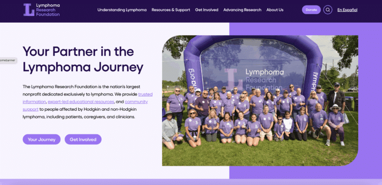
The Lymphoma Research Foundation (LRF) has cohesive branding across the entire website, with email campaigns and social media designs to match. Their brand is instantly recognizable due to the distinctive purple color and consistent use of imagery and logos.
Learn how the Lymphoma Research Foundation uses cohesive design to elevate its nonprofit’s digital presence.
9. Use impactful visuals to tell a story.
We live in a visual world. Your website should be a treat for the eyes so visitors want to stay longer and see what you have to say. There are lots of ways to make a website visually delightful, and most of them can be used together in moderation.
- Images: Choose images for your website that are high quality, colorful, and action-oriented. Research shows that people identify more with human faces than anything else, especially when they can see the eyes of the person in the photo. Whenever possible, try to capture real photos of your organization at work so that your audience can identify more closely with your mission.
- Graphics & Illustrations: Some websites use illustrations, icons, and other graphics to supplement sparse imagery. This can result in a great look! Just remember to be consistent with the type of graphics you use and avoid using a different style on every page.
- Color & Other Design Elements: Put a colored background behind text that you want to stand out. Use brightly-colored buttons for calls-to-action instead of links in the text.
One more thing to keep in mind is that there is a fine line between exciting and overwhelming. As you design your site, make sure you choose an attractive color palette and that your images line up with the goal of your organization.
See This Nonprofit Web Design Tip in Action

The website for Live Out Loud combines colors, graphics, and impactful images to create a clear picture of who they are, what they do, and the people they help. The imagery is consistent in theme, but also is used to convey specific points and feelings throughout the website.
10. Include numerous avenues for supporters to get involved.
In the nonprofit world, you depend on supporters coming together in a lot of different ways to help the cause. Part of your nonprofit web design strategy should be to include multiple invitations for people to get involved in what you do.
You can do this by adding specific pages for all of your support needs, like volunteering, helping advocacy efforts by sharing on social media or writing letters, attending events, and, of course, donating.
After the pages are set up on your website, make sure you include calls to action on other relevant pages to help people find this information. And remember to make it easy to sign up, donate, or register by including secure forms on each page.
See This Nonprofit Web Design Tip in Action

Nonviolent Peaceforce offers plenty of opportunities to help out and get involved with their mission. Each one is easy to find since they also have clean navigation, colorful buttons, and specific calls-to-action on each page.
11. Build and maintain a consistent blog presence.
One of the best things you can do on your website is to build up your blog. A blog has so many benefits! All that fresh content helps with SEO, and the blog offers you chances to keep your supporters updated on what you are doing and the impact you are having, which can help increase your supporter base. Here are a few ideas to add to your blog strategy:
- Celebrate and thank your volunteers.
- Share your success and impact stories.
- Tell people what you need and why you need it.
- Offer tips and advice around your cause.
- Share news and research findings.
See This Nonprofit Web Design Tip in Action

The Friends of the Earth Blog is updated regularly with helpful, informative content that is highly relevant to its mission and its audience. As an added bonus, the main blog page offers search options that allow this organization’s audience to easily find and read the content they are most interested in.
12. Make sure your calls-to-action are crystal clear.
No matter where a visitor is on your website, they should know how to take action when they are ready. You can help them with a clear call-to-action (CTA) on each page.
Set your CTAs apart using color, specific styling, and clear wording.
This is not the time to be passive. Instead, clearly state the action you want visitors to take after reading the information on your pages. Messages like, “You can help save more baby otters by donating!” with a button that says, “Donate Now!” is perfect.
Keep in mind that to be really effective, you should only have one big call-to-action per page. This will help your visitors since they won’t have to decide which CTA to choose. If you have multiple needs, spread them out around the website on relevant pages to guide visitors on a logical path. You can also include links to other actions on your thank-you page so that visitors have an easy option to do more.
See This Nonprofit Web Design Tip in Action

The Hollings Center for International Dialogue website has a lot of options for getting information and getting involved. It also clearly displays each opportunity with bold buttons and colorful styles that make it clear where users should click to continue their journey through their updated website.
See how The Hollings Center makes every next step obvious to supporters.
13. Simplify your conversion forms.
The forms on your website should be accessible, easy to understand, and simple. You want to make it as easy as possible for supporters to sign up for your mailing list or send a donation, so don’t add a lot of extra questions for them to answer. You should only ask for the exact information you need, and save demographics or opinion questions for separate surveys.
Here are a few more tips for making your forms simple and easy to understand:
- Follow a logical order for the information and group like items together.
- Include helper text above the form field so people know exactly what the form is asking for. You should also avoid using sample text in the fields since that can be confusing to some people.
- Use radio buttons or checkboxes instead of dropdown menus.
- Enable a clear error notification with more than one indicator (i.e. it can change color and be highlighted in a box).
- Include a status message to let viewers know their message or donation has been received.
See This Nonprofit Web Design Tip in Action

Penny Appeal USA features integrated forms throughout the website, but they are so simple and such a great fit to the design that they are a welcome addition rather than an interruption to the content.
14. Include internal and external links across your site.
Including links in your content is helpful to your audience and great for SEO!
Internal links help your audience to find the content they are looking for without having to revisit your menu every time. They are helpful to SEO because they help web crawlers create a more accurate map of your website and how the pages relate to each other. Here are some tips for strong internal linking:
- You should link to internal content whenever it is relevant. For instance, if you mention your programs in your content, make sure you add a link to the Programs page in the part of the sentence that says, “our programs”.
- Try to avoid generic link text like “Click Here” or “Read More” since this non-descriptive text is unhelpful to your audience and counts against SEO scores.
External links are helpful to your audience because they usually refer to helpful and relevant content. They are great for SEO as well because the crawlers associate your website with the websites you link to. The more respected those websites are, the more your website will benefit from their reputation through association. Here are some tips for external linking:
- You should add external links whenever it is helpful to your audience. This can include citing your sources, referring to government websites and guides, and promoting partners.
- Be careful which websites you link to. Since putting the link in your content essentially says you support the information on that website, linking to inaccurate or spam websites will count against you.
See This Nonprofit Web Design Tip in Action

Chesapeake Climate Action Network has a helpful and functional link structure that helps users navigate the information on the website and find relevant supporting information across the internet.
15. Empower supporters to spread the word with social sharing buttons.
Most people have wide social media networks full of like-minded people. This means that each time they share your content the reach of your organization expands exponentially!
Make it easy to share and spread the word by including social sharing buttons on your website.
These buttons can be specific to advocacy posts, included in calls to action, or both! Just make sure they are clearly visible and include help text that explains what the button is for. For example, include several social sharing buttons at the bottom of your blog posts with the CTA of, “Share this content with someone you care about!”
You want to include links to your social media accounts in the header or the footer of your website as well so that your audience can follow your posts no matter what platform they are looking at.
See This Nonprofit Web Design Tip in Action

Physicians for Social Responsibility Los Angeles (PSR LA) has an active social media presence that helps to inform and engage their audience. By integrating their social profiles into the website they make it easy to follow their progress and share updates that attract new supporters.
By following these nonprofit web design best practices you are setting your organization up for the ultimate online success. Combined, these strategies will help you create a website that is searchable, accessible, and irresistible to people who are destined to be your supporters.
You can also work with a nonprofit web design company to get even better results!
Looking for other helpful resources? Here’s some recommended reading:
- Top Nonprofit Web Design Companies To Boost Your Reach. Working with a nonprofit web design agency can set you up to create and maintain a high-quality nonprofit website. Get all the details in this guide!
- Google Ad Grants for Nonprofits: Your Guide to Success. Google Grants can help you get more online attention for your mission. Learn how to jumpstart the process of securing a Google Ad Grant.
- Google Analytics for Nonprofits: The Ultimate Guide. Want to learn more about your website visitors? You should leverage Google Analytics! Learn more in this guide.