How you use color is important on the web.
Color schemes immediately help visitors recognize your brand, accent colors guide them to the important parts of your website, and contrasts even help to determine the accessibility of your site.
Unfortunately, we aren’t all experts at how to use color and color theory. Thankfully though, you don’t exactly need a color wheel in hand to design a website.
In most cases, the color scheme for any website should include around five different colors: a base color, and accent color, and neutrals like black, white, and gray.
Starting with a Logo
Often, organizations approach us for a project with an existing logo. This can be a great place to start when determining how to use color with your website. Sometimes, the logo guides the site’s base color.
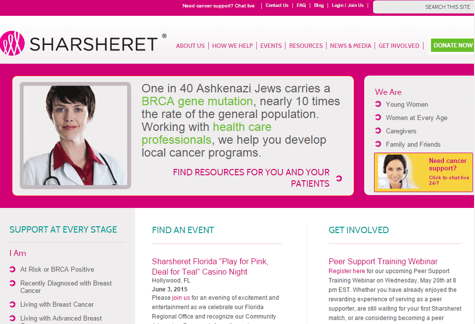
For example, Sharsheret – a national nonprofit organization supporting Jewish women and their families facing breast cancer – uses a vivid pink in their logo, which carries through as the primary color on their website.
Other times, a client’s logo determines the accent colors across a website.
The accent color for the website may even be more important than the base color as it is often used for the Call to Action on your website – and in the nonprofit world, this often includes the donation button. For example, you can see how Sharsheret’s donation buttons are distinguished with their bright green accent color.
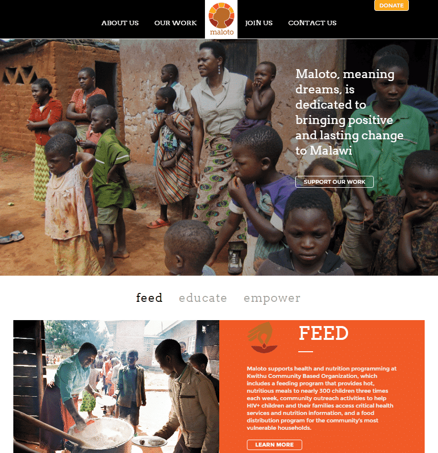
Maloto – an organization working to feed, educate and empower children in Africa – has a logo filled with bold oranges and yellows. While their site is primarily black and white, these accent colors are used in the menu and on the site’s homepage to create a warm and welcoming feel. They also highlight their most prominent Call to Action – a donate button – in yellow.
Expanding from the Base Color
There are many tools to help guide these color decisions and a quick search yields dozens of options. It can even be tempting to spend hours hitting the space bar to tab through color options on https://coolors.co, a website that randomly generates color schemes. This is fun option for exploring possibilities if you’re starting from scratch.
When working with existing color options, we like Material Design’s Color Tool which allows you to create color schemes, apply them to a basic user interface, and even determine which font colors and opacities are most accessible for your website.
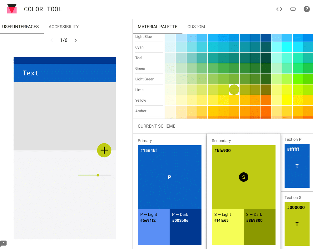
In determining a color scheme, users are asked to select both their base color and accent color and are given six colors to use on their website in return. While these tools don’t precisely determine a website’s final color scheme, they can be helpful in visualizing how your brand’s colors will look together online.
Ensuring Accessibility
Once colors have been chosen, we use Material Design’s tool to investigate the accessibility of a color scheme. Did you know that certain types of colorblindness can make it difficult for users to access your website?
While many browser add ons and programs exist to help ensure accessibility on the web, this tool provides a first look at whether white text or black text is a better fit for sections of your site.
Working with a designer or web development agency makes integrating accessible color on your website easier but it’s always helpful to know why your font color choice may not work, or why we’re suggesting that your donate button could be a shade other than red.
But How Does it Make You Feel?
Do you want users to feel motivated when they come to your site? Maybe you want them to feel welcome? Maybe you’re looking for a more exciting result.
Online tools can help us use color schemes that work well in terms of color theory but when engaging users, it’s also important that we use colors that also convey your brand and your mission.
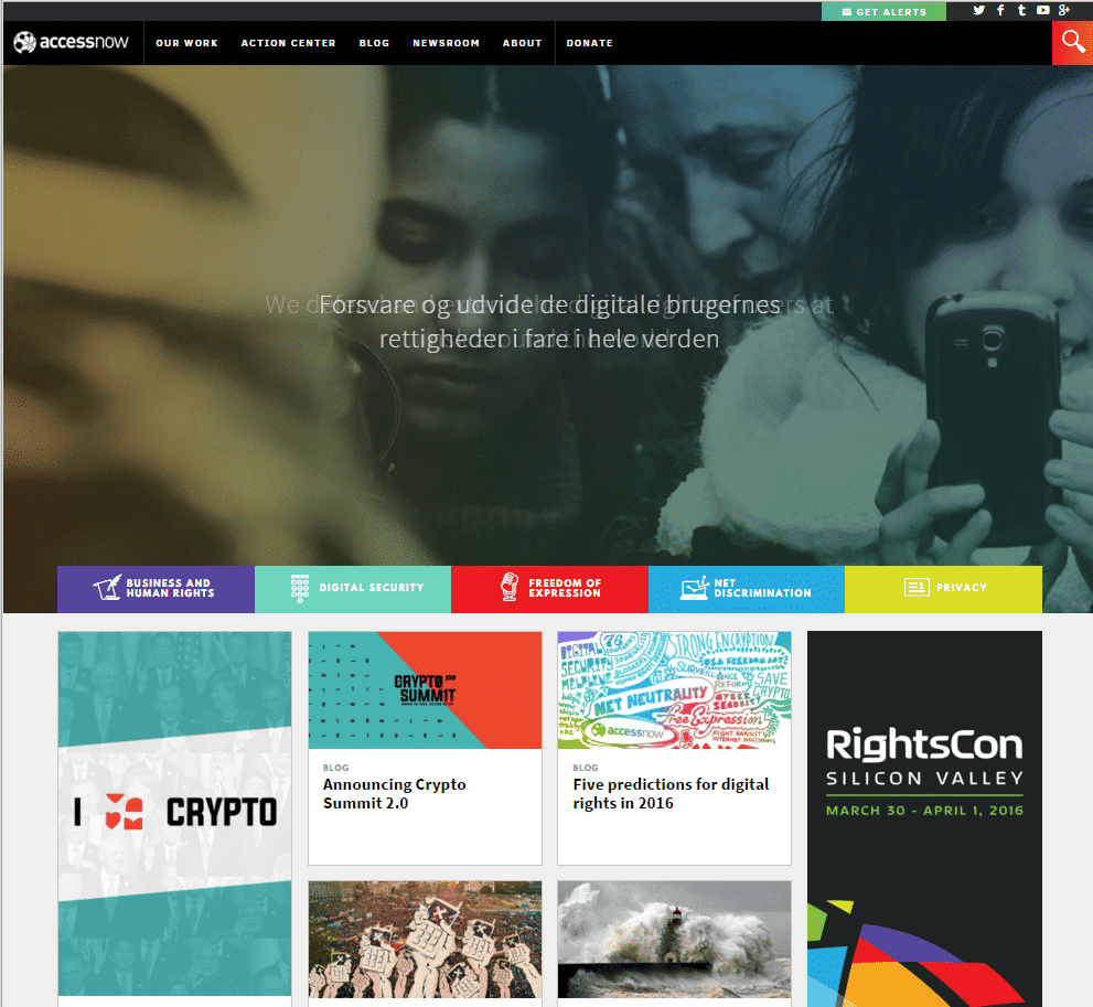
For example, sometimes bright colors can be distracting; too many colors on a single page may be overwhelming. But, for Access Now – an organization dedicated to defending the digital rights of users at risk around the world – bold colors help users navigate large amounts of information, while also clearly expressing the organization’s serious goals.
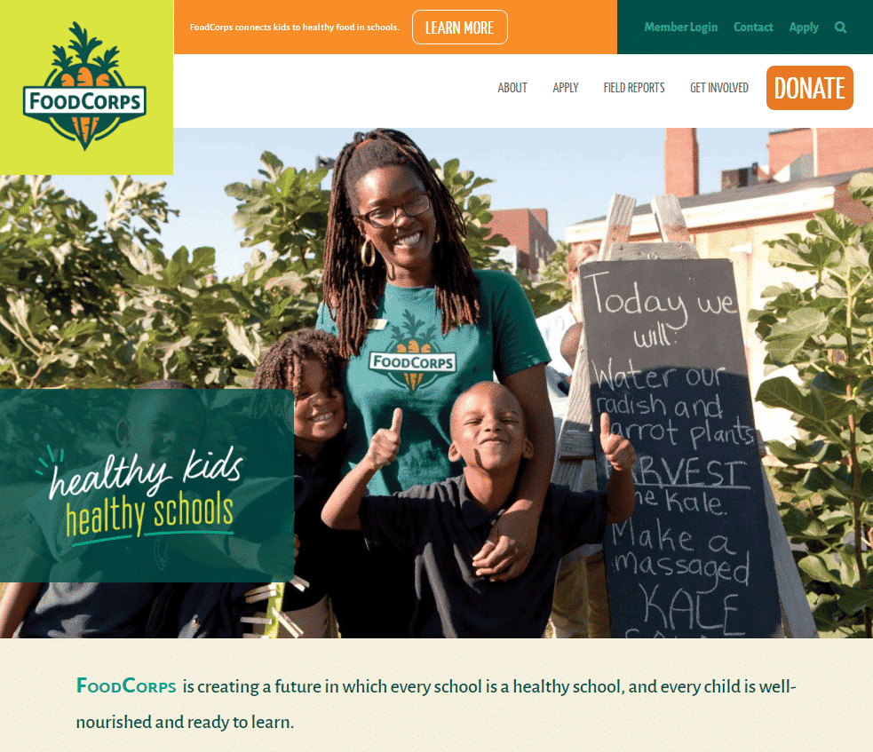
In contrast, the bright colors on the FoodCorps website feel welcoming. They immediately help the user connect plants and vegetables with the organization’s goal of supporting kids and communities with healthy foods in schools.
When you’re ready to update your site’s look, we’re ready! Our team is savvy in visual design, from creating logos to choosing the right color scheme that will best engage your audience. Our approach blends creativity with modern usability best practices and an understanding of your audience’s needs to produce work that’s beautiful, memorable, and effective.