

With their new site, they wanted to take advantage of the opportunity to not only make their site easier to navigate, update the styling, and improve load times, but create a better way to showcase their history and current work.
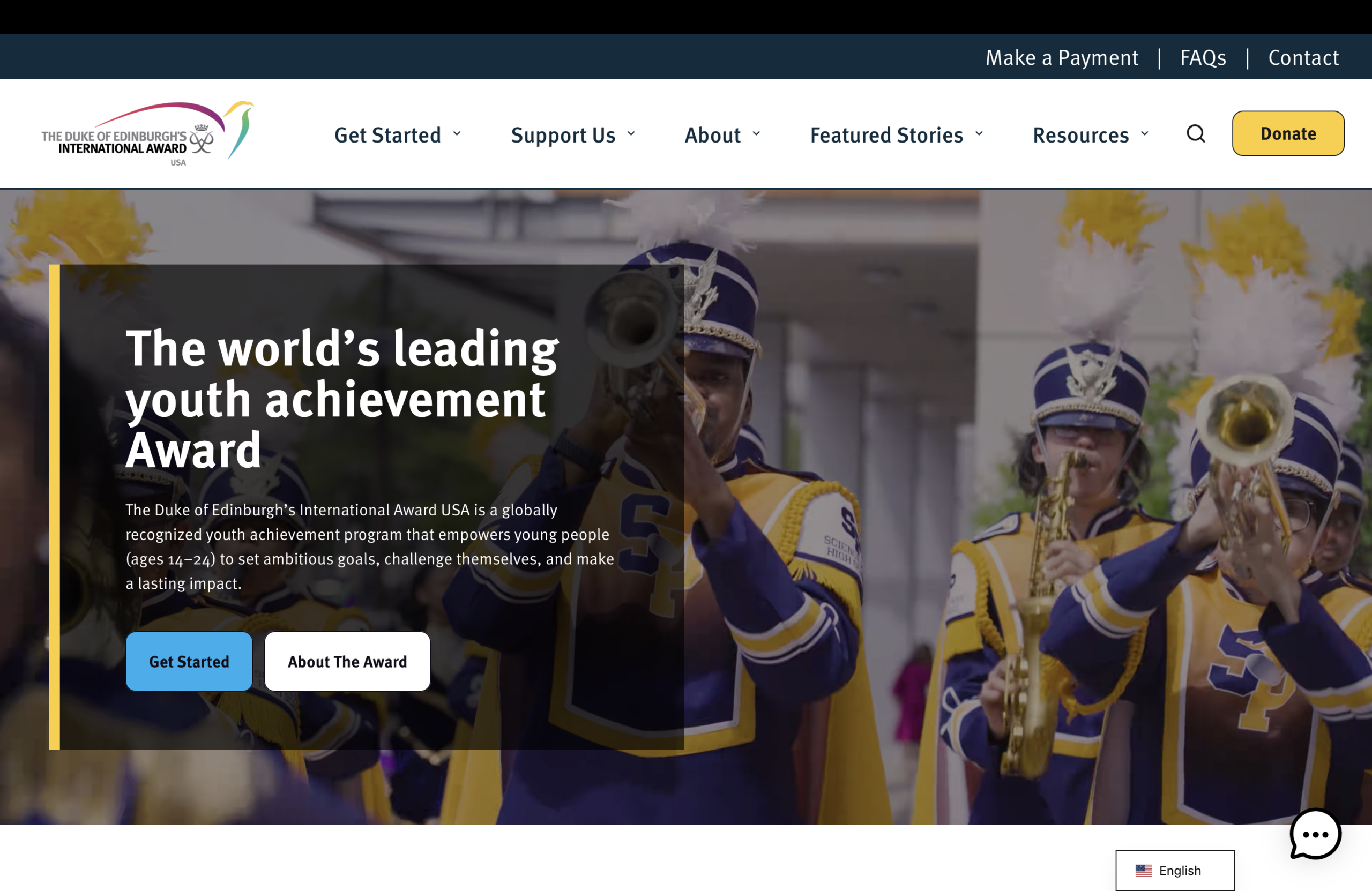
From a design standpoint, one of the biggest issues with the old design was how difficult it was to navigate, leaving visitors confused and unsure of where to go. In our redesign, we focused on creating clear paths from one page to the next in a user’s journey, making the menu easy to understand from the homepage and providing access to all main pages from it.
As we made improvements to the design, we were able to update many of the issues that were causing poor load times. These load times were leading to increased amounts of users leaving the site before performing an action so it was a high priority for our project to reduce these bounces off the site. Our updates to the site allow users to navigate through the site much more seamlessly.
We also focused on celebrating their history and work by creating a timeline view for the history of the organization and sidebar for recent filings. The timeline highlights major milestones like their origin as the Industrial Power Consumers Council, submitting their first comments to the Federal Energy Regulatory Commission(FERC), and the procession of their presidents and CEOs.
To display their most recent filings separate from the main filings and testimonies page, we created a sidebar as part of the menu that users can access from any page across the site, allowing visitors an easier way to get to the information that matters to them.
Overall, we’re excited to have made a much more user-friendly and aesthetically pleasing site that ELCON can utilize for years to come to showcase and support their mission.