Sometimes I think “bad nonprofit donation form choices” could be its own drinking game. Of course, we’re not in the habit of boozing it up in the middle of the work day. But we do love taking shots at bad forms and serving up tips and tricks for improving them!
Now, I don’t want to bottle up our knowledge like some kind of exclusive top shelf. Instead, I’ll pour it out here, and let you discover the proof yourself.
Here are our favorite tips for improving any nonprofit donation form:
- Pay attention to your nonprofit donation form branding.
- Strategically select your giving levels.
- Customize your donation amounts by gift types.
- Make sure your nonprofit donation form is mobile-responsive.
- Show how donations will impact your work.
- Remove the cancel button!
- Ask for smaller, recurring gifts with a recurring pop-up.
- Make donating easy with a clear donate button.
- Put your donation button EVERYWHERE.
- Reduce the number of clicks it takes to make a donation.
- Integrate your online payment methods.
Pay attention to your nonprofit donation form branding.
Don’t just slap your logo on the top and assume people will trust that your form is legitimate. Retain other elements of your site’s brand, including colors, fonts, button styles, and even images. Quality donation form design and branding ensures your visitors recognize your organization and feel comfortable on your donation form.
Go one step further and remove your usual site navigation from your donation forms. This helps to increase donor engagement since your users are less likely to get distracted and wander off.
Some CRM platforms provide better features and control over settings than others. See what you can do to improve donors’ giving experiences by customizing images, text, giving levels, and form fields.
Strategically select your giving levels.
Most people don’t give any thought to giving levels when setting up a donation form. They’ll often either keep the default donation amounts or select random numbers.
But these giving levels are actually very important! The amounts you select for your donation pages help your donors determine how much they should give.
In our experience, people most commonly select the second lowest donation amounts on fundraising forms. They want to go as low as they can without appearing to be cheap!
To determine which amount you should set as your second giving level option, you’ll need to do some research. Look at your past donations to find your average gift and review some benchmark studies, like the awesome studies from M+R.
Try setting your second highest option slightly above your current average. This way, you end up with one giving level below your average and several that are above your average. For example, if your average gift is $120, then your giving options could be $50, $125, $250, $500, and $1000.
Use your current data to make your form work best for your donors. If, for example, no one has ever given $1000, remove that option. If people are happily giving $125 and $250, try moving increasing your second option to $150.
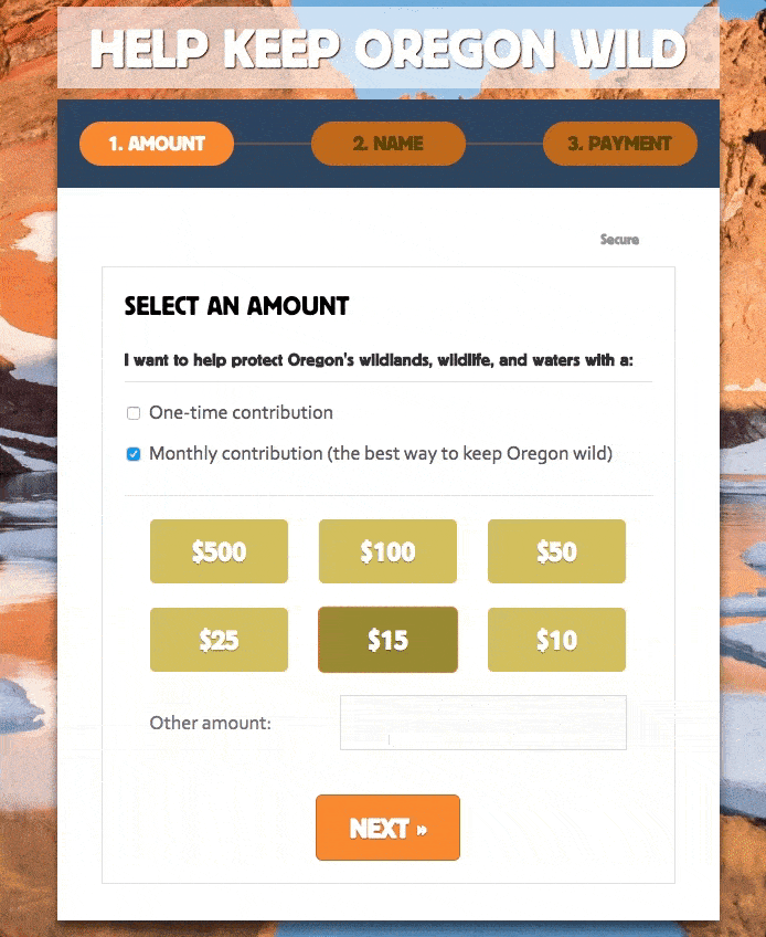
Customize your donation amounts by gift types.
You should always customize your donation amounts for one-time and recurring gifts. Why? Because it’s rare for someone to give $125 — or even $50 — monthly.
Many fundraising platforms allow giving level customization, though some may need to be customized with JavaScript. For example, you can see how we updated the Animal Rescue Foundation’s donation form to display different amounts for a one-time versus monthly donation selection.

Pay attention to the amounts you choose, and you can increase giving and inspire new donations for your organization.
Make sure your nonprofit donation form is mobile-responsive.
Considering donors often immediately close a form on a mobile device if it’s not mobile friendly, designing donation forms for mobile is incredibly impactful.
Make sure all of your forms are mobile responsive to provide all of your donors with the best possible experience.
Let’s Chat About Your Project!
Show how donations will impact your work.
Showcase your work with strong images to ensure your donors feel committed and connected to your mission while they complete the donation process.
We helped our friends at Penny Appeal Canada build custom donation forms using Gravity Forms. As donors hover over the various causes, a different image shows the impact the donation will have on people around the world.

Remove the cancel button!
This is a small pet peeve on mine, but surprisingly, many platforms have a default “cancel” button on their donation forms. These buttons are often easy to click on accident and aren’t really all that necessary. Avoid dissuading your donors and remove “cancel” options from your donation forms.
Ask for smaller, recurring gifts with a recurring pop-up.
Here’s an easy way to get more donations: Ask for a smaller, recurring gift, instead of a larger one-time gift.
Why? Monthly giving program data consistently shows that donors who sign up for recurring donations result in more donations over time than do those who give individual donations.
We helped Friends of the Earth and Jewish Voice for Peace expand their monthly giving programs through the use of customized “lightboxes” that overlay their donation forms.
When donors complete the donation form and click on the submit button, they are prompted to either update their donation to a monthly gift or continue with processing a one-time donation. Both of these options are given equal prominence, presented in an elegantly-designed lightbox.
A recommended monthly donation amount is calculated using a script that checks the original one-time donation amount. Then, a pop-up panel presents a monthly gift amount option that’s approximately 20 percent of the original amount.

In tests with Friends of the Earth, we saw a 4.3 percent conversion rate of people who chose the recurring option. This accounted for an increased “annual” gift from $100 to $240. Based on their average gift of $70 and this 140% increase from the extra revenue from the recurring gifts, Friends of the Earth is receiving an average addition of about $5,300 per year!
Jewish Voice for Peace was even more successful with a conversion rate of 10.53% and a 140% increase in annual amounts. Considering their average gift of $59 and total number of donors during a year, they stand to net an additional $11,886 by using the lightbox for a full year.
Make donating easy with a clear donate button.
If a potential donor has to hunt for where to make a donation on your website, chances are they won’t give. Just as you showcase the amazing work your organization does, be proud of your fundraising efforts that support that work.
Adding your donation link as a part of your navigation and using a color that denotes action on your site is a great way to make donating easy. Our friends at Meals on Wheels America do a great job of this!

Put your donation button EVERYWHERE.
Now that you’ve made your donate button stand out, you don’t have to stop there. Make sure the opportunity to donate follows your user wherever they go on your site. While having your donation link in your navigation will mean it is always available, there are other creative ways you can engage your users and make donating easy.
Our friends at Interfaith Alliance implemented a scrolling sidebar that literally follows you wherever you go. Click on it and out pops an opportunity to both join their newsletter AND donate.

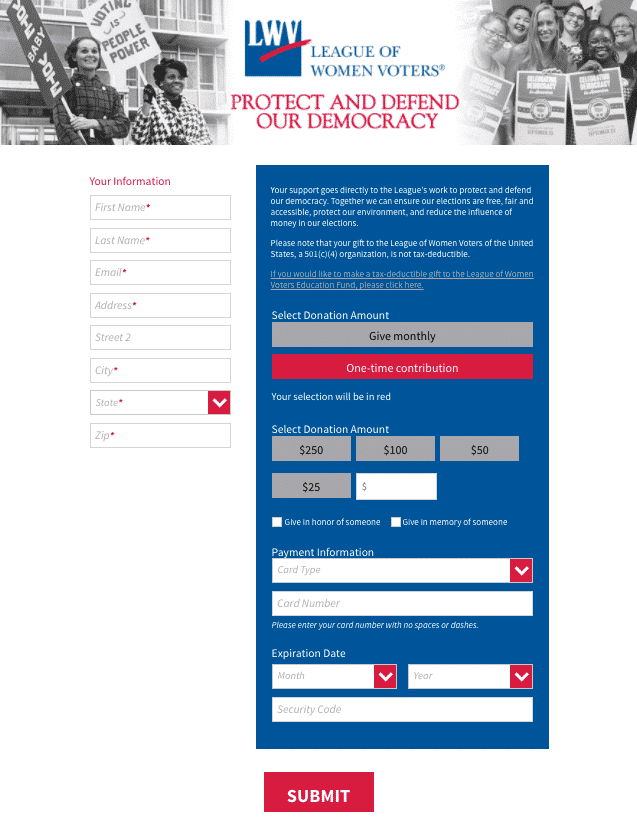
Reduce the number of clicks it takes to make a donation.
In our fast-paced world of 24-hour news, insta- everything, and Amazon Prime, don’t make your users jump through hoops to submit a donation.
Make the process as close to one-click as you can! We just rolled out a brand new nonprofit donation form for League of Women Voters, where their donors can more easily enter their information, select their donation amount, enter their credit card information and submit.
Integrate your online payment methods.
Can’t find your credit card? No problem! There are ways you can still invite your supporters to donate without the hassle of entering a pesky credit card number.
Many online fundraising platforms are starting to support online payment vendors like PayPal, Apple Pay, Visa Checkout, MasterPass, and Amazon Payment, where payment information is securely transferred from the vendor to the payment recipient. While these services do have a processing fee like other merchant gateways, they are trusted by users and make giving even easier.

The best way to encourage donations on your website boils down to this:
Make it hard for donors to ignore your ask by making your donation forms attractive and accessible, and make it as easy as possible for them to donate by streamlining options.
These simple changes will make your nonprofit donation form even more successful and effective! Cheers!