

The Problem
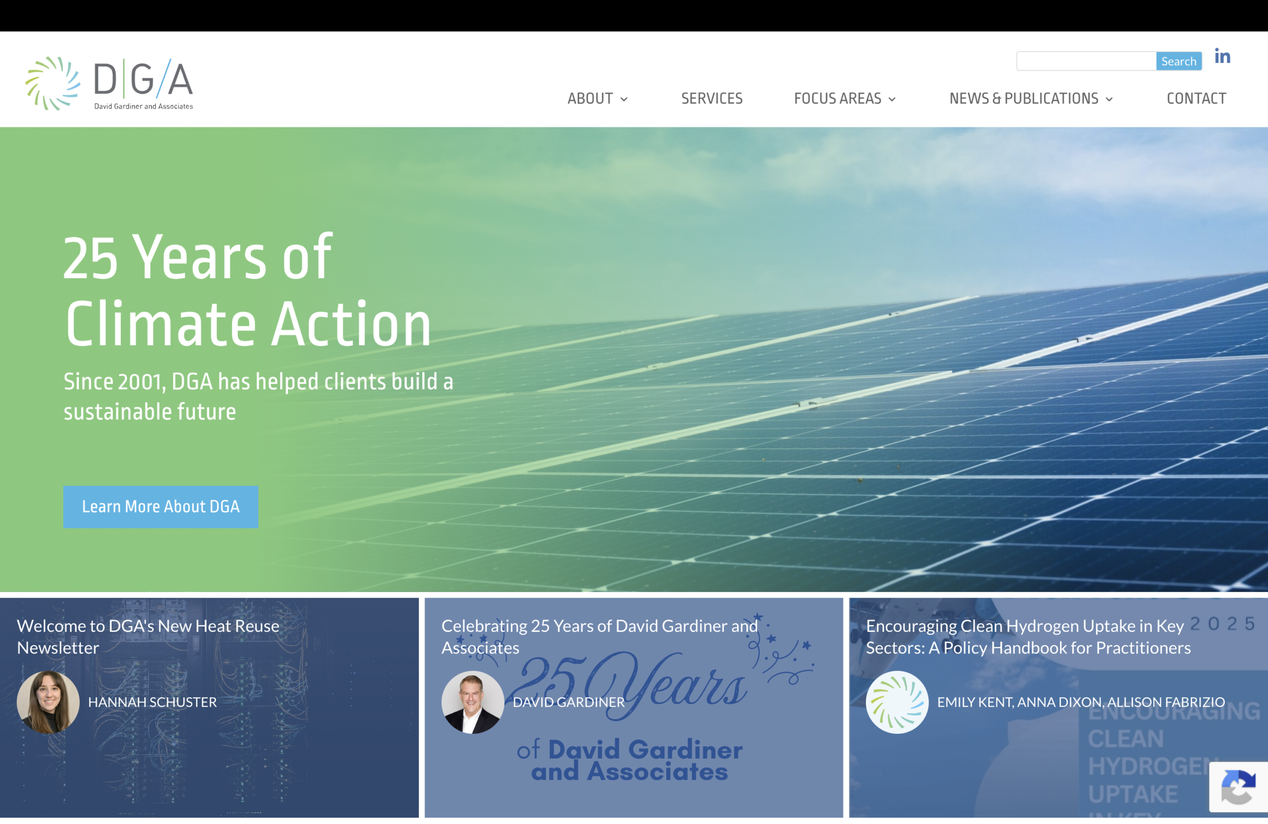
David Gardiner and Associates (DGA) is a respected consulting firm working at the intersection of climate, energy, and environmental policy. Their website had a strong foundation — but it wasn’t fully doing justice to their work.
The biggest gaps were visibility and clarity. DGA’s publications and reports — some of their most valuable assets — weren’t easy to find. Their Services section felt unclear, making it harder for visitors to quickly understand what DGA does and how their work is organized. Rather than a full redesign, DGA wanted targeted, high-impact improvements that would make the site more useful without disrupting what was already working.
Our Approach
We started by identifying the areas that would deliver the most value, then focused our energy there.
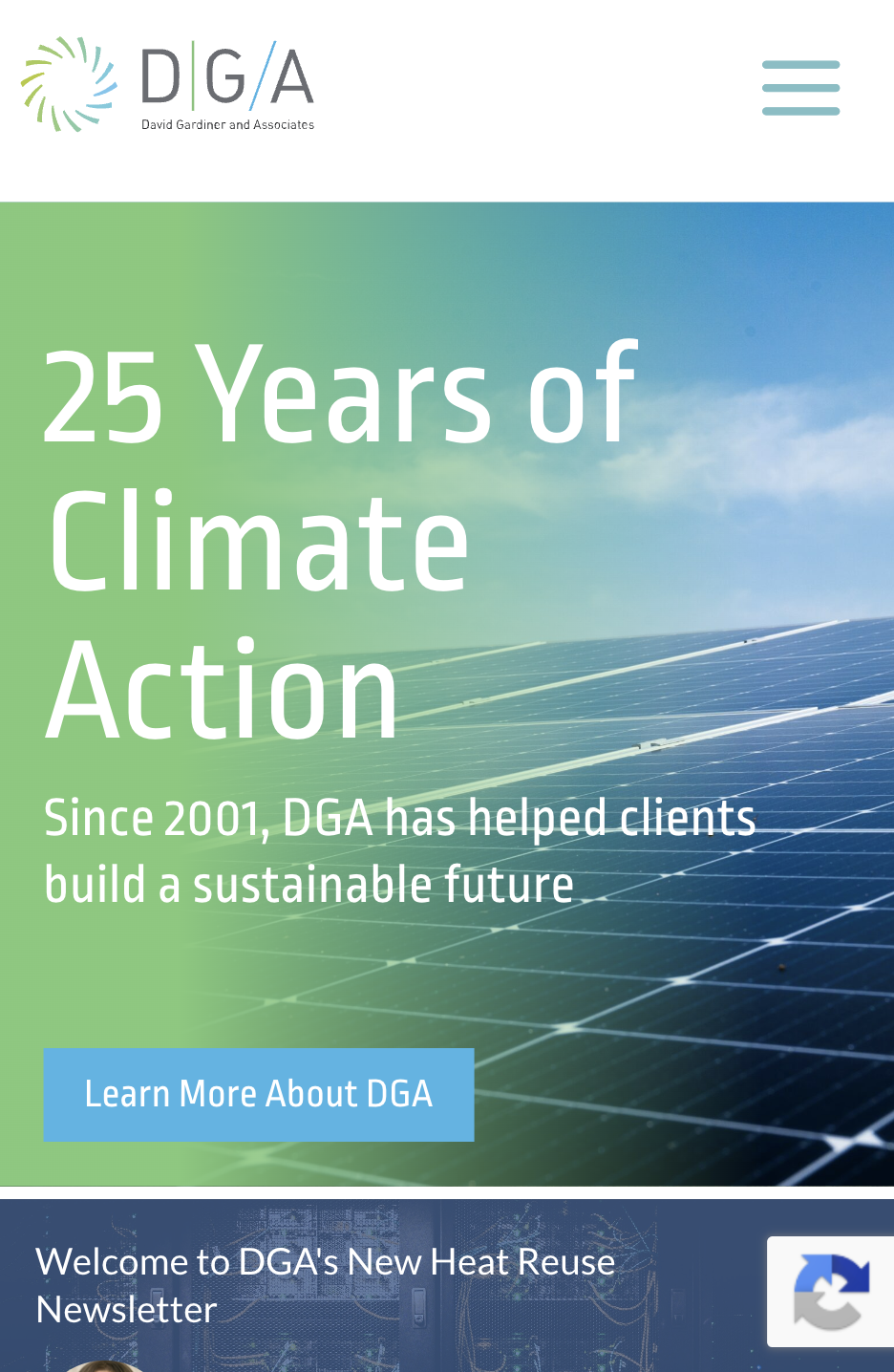
On the homepage, we adjusted the content hierarchy to give DGA’s research and reports more visibility. We also streamlined the page — removing or repositioning elements that no longer reflected the organization’s current priorities — so that first-time visitors and returning ones alike could get oriented quickly.
The Services section received a more strategic overhaul. We worked with DGA to help them more clearly articulate their offerings and how they’re organized. That meant restructuring service content, improving layout and navigation, and making it easier to surface related materials — like publications and projects — alongside each service area.
Behind the scenes, we implemented updated taxonomy capabilities within their CMS. This allows content to be tagged and reused more flexibly across the site, making it easier to maintain consistency and surface relevant content as DGA’s work grows.
The Solution
The result is a website that works harder for DGA — and for their audiences.
Visitors can now understand DGA’s services at a glance, find relevant research more easily, and move through the site with greater confidence. The improved content structure gives DGA more control over how their expertise is presented, without requiring ongoing manual effort.
And because we focused on targeted improvements rather than a full rebuild, DGA got meaningful results efficiently — on a timeline and scope that made sense for their team.
Results
What makes this project stand out is its intentionality. Not every website challenge calls for a redesign. Sometimes, the right answer is knowing exactly what to fix and doing it well.
- Clearer service communication that helps visitors quickly understand DGA’s areas of expertise
- Greater visibility for research and publications, the assets that best demonstrate DGA’s thought leadership
- Flexible taxonomy tools that make it easier to tag, surface, and reuse content across the site over time
- A streamlined homepage that reflects DGA’s current priorities and guides visitors toward the right resources
By focusing on the changes that mattered most, Cornershop helped DGA build a stronger, more coherent digital presence — one that better reflects the depth and impact of their work.
See more of our Web Design, Content Assistance, and Site Map work!