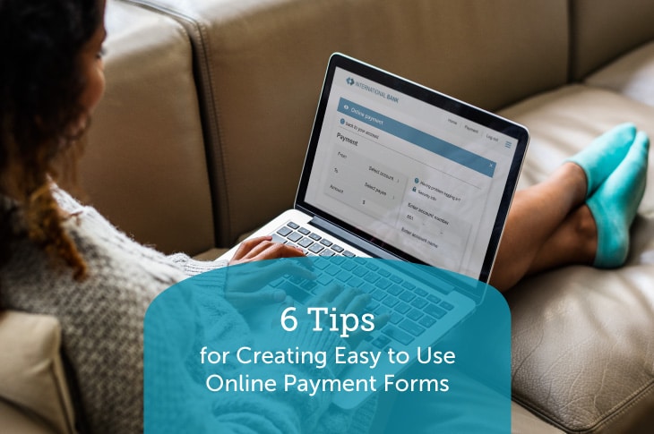
Filling out an online payment form isn’t a common favorite pastime. Some forms take forever to fill out, some have questions you don’t know how to answer, and some forms just seem untrustworthy or insecure. In fact, these negative experiences are often the reason why people fail to complete certain forms. However, by incorporating some key design tips and focusing on user experience, your online payment form doesn’t have to be a hassle to fill out.
For nonprofit organizations, online payment forms include donation forms, event ticketing forms, or storefront purchasing forms. These forms collect key details on supporters and securely process financial information. As a nonprofit leader, it’s your responsibility to ensure supporters have access to an easy-to-use payment form in order to further your mission and increase online fundraising.
We often work with small businesses and organizations to make sure they’re safely processing online payments. Here are our top tips to help nonprofits like yours optimize your own online payment forms and increase conversion rates for your organization:
- Embed your payment form on your website.
- Don’t overwhelm users with too many questions or fields.
- Optimize your form for mobile users.
- Provide reassurance on security.
- Make sure you can accept all types of online payments.
- Automate email communications.
You don’t want a passionate supporter to drop out of giving just because your online form takes too long to fill out.
Ready to dive into our top tips? Let’s begin.
1. Embed your payment form on your website.
If you want supporters to make an online gift to your organization, it’s important to make the giving process as streamlined and straightforward as possible. An easy way to accomplish this is by embedding your online payment form into the relevant nonprofit website page.
This seems simple enough, but many organizations do send their donors to third-party sites in order to collect donations. This not only interrupts the giving process, but it can look confusing and untrustworthy for users to share their personal and sensitive information on a site they don’t recognize.
In fact, according to this Regpack resource on online payments software, embedding your form on your website can result in a 31% increase in conversions.
For example, with your online payment form embedded into your dedicated donation page, you can use your own content and web design around the form to increase conversions. Make sure you put your nonprofit logo and mission statement at the top of your donation page in order to remind supporters of why they’re donating. However, don’t overcrowd the page with too much content. Use plenty of white space to clearly highlight and guide users to your payment form.
2. Don’t overwhelm users with too many questions or fields.
Often, users will abandon a form that takes too long to fill out. A long and complicated form can drive even your most passionate supporters away from giving online.
Make sure the online form builder or donation tool you use allows full customization capabilities. You don’t want to rely on cookie-cutter payment form templates, though those can be great places to start. Your form fields should be relevant to the campaign or event at hand and should only require the most essential fields.
For instance, you’ll likely require:
- Name
- Address
- Email address
- Donation/payment amount
- Payment type and information
From there, consider what fields you need that might be unique to your fundraiser. For example, if your form is going to be promoted in conjunction with a fundraising event, you might need to have form fields for ticket amounts or fundraising tiers. Make sure you mark all of your more important fields as required.
If you do want to ask unrequired questions, limit those to one or two. A common question you might add is asking how the supporter found out about your online fundraiser. For key (but not absolutely necessary) datapoints like this, consider adding fields for those questions on the confirmation page of the payment form so as to not disrupt the payment process.
3. Optimize your form for mobile users.
Did you know that by 2025 it’s predicted that nearly 75% of the world will be smartphone-only users when it comes to accessing the internet? This might seem unbelievable, but it’s a clear indicator of the increasing prominence of mobile devices in our daily lives. We use these devices to communicate with people, learn about the world, apply for jobs, and donate to charitable causes.
That’s why it’s critical that your online payment form is optimized for mobile users. An unoptimized form may look clunky, may not show all fields, or may just generally be hard to navigate. Some easy ways to quickly optimize your form for mobile use:
- Keep the form layout vertical.
- Ensure text and button sizes are large enough to be seen on any screen.
- Use this free Google tool to test for mobile-friendliness.
Optimizing your form and the rest of your website is great for increasing overall accessibility. This is because accessibility improvements ensure that more supporters can interact with your nonprofit site no matter who or where they are.
4. Provide reassurance on security.
Sometimes an online payment form can be daunting for supporters because they simply don’t trust it. This mistrust is often due to a poorly-designed or an unbranded third-party page. Without some sort of affirmation of security, supporters will simply exit the window and move on with their lives. After all, no one wants to risk having their financial information hacked or subject to fraud.
How can you provide some reassurance to your supporters on the security of your online payment form?
- Make sure your online payment tool is PCI-compliant.
- Invest in a solution with common fraud protection tools like VPNs or a payment gateway.
Along with these protective measures, it’s helpful to clearly state your security practices within your payment form. For example, in the same place where the donor is filling out their card information, make sure to include a disclaimer or sticker officially stating that the tool is PCI-compliant.
5. Make sure you can accept all types of online payments.
The best part of being able to pay online is the sheer convenience of it. No longer do your supporters have to come in person, send a check, or call on the phone if they want to quickly make a gift. They can donate from the comfort of their own home or even while on-the-go.
However, this convenience is taken away if your online form doesn’t accept their preferred type of payment. Not all of your supporters will be using the same method to make their online gifts or pay for a nonprofit-branded t-shirt. While you can look at different solutions to cater to each payment type, it’s much more efficient and worthwhile to invest in a payment provider that can process them all.
Here are the payment types that you should make sure your nonprofit can accept:
- Credit/Debit
- ACH payments
- E-checks
- Smart wallet or payment apps
Entering payment information is often the last step of your online giving process. Don’t turn supporters away at the very end just because you don’t accept their form of payment. With the right payment provider, your online forms are sure to welcome more donors and increase online conversions.
6. Automate email communications.
Once the payment form has been completed and you’ve successfully transferred the necessary funds, that doesn’t mean your work is over just yet! It’s imperative that once the payment is received, an email is sent to your donor or buyer with a receipt and confirmation of the transaction.
Your payment provider should include capabilities to automate this process. This way, there’s less work for your staff and for your supporters. No longer do you have to wonder if the gift was received— the confirmation will be sent as soon as your processor successfully handles the payment.
Automating your communications around your online payments and orders is a huge benefit of a comprehensive and integrated payment system. Rather than collecting payments and communicating with your supporters manually, you can spend more time engaging your donors and expanding your nonprofit.
This also helps set the stage for future engagement with your supporters. Whether they made a donation, bought an event ticket, or bought merchandise, that first email to a donor is the beginning of a long-lasting and valuable relationship. However, it’s only as valuable as the conversations you continue to have with them. Make sure to personalize each email with the recipients’ names and use your donor and payment data to effectively target your email content.
Wrapping Up
To summarize, an easy-to-use online payment form is crucial if you want to increase your online fundraising revenue and improve your supporters’ user experience. Remember, keep the process simple and streamlined; you want to make filling out the payment form as easy as possible. With the tips above, you’re set for success. Good luck!


